Preview image. Unlock full-res
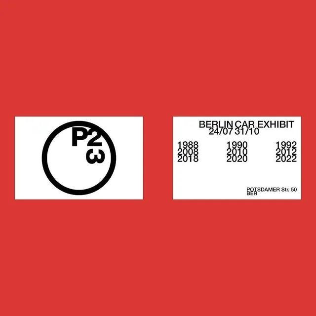
Institutional exhibition identity featuring a bold red field with two white panels containing a geometric logo and event details, using swiss-style typography.
Summary
An institutional exhibition poster in red and white featuring a geometric circular logo (P2 3) on the left and dense event information on the right, using strict swiss-style typography and spacing.
Visual description
A bold red background field contains two white rectangular panels with black borders, each inset and separated by red. The left panel displays a heavy black circle enclosing the alphanumeric identifier "P2 3" in bold sans-serif. The right panel lists the exhibition title (BERLIN CAR EXHIBIT), dates, and location (POTSDAMER STR. 50, BER) in tightly-spaced sans-serif, organized into three columns of year pairs. All type is black on white, grid-aligned, with generous padding within each white container.
Key takeaway
The simplicity of using two white containers as breathing room within a saturated color field, the legibility of columnar information density, and the way a single geometric form (the circled identity) anchors one half while text anchors the other. Strong for exhibitions, institutions, or any context requiring clear, memorable information.
Reuse notes
Effective for posters and printed materials where both visual identity and practical information (dates, location, times) must coexist. The red provides unmistakable visibility at distance; the white panels ensure legibility up close. Scale this pattern when signage needs to be both bold and instructional.
More like this




Keep what you find
A free account saves references to boards and can send you a weekly email of picks based on what you save.
To see every result, go Pro.