Preview image. Unlock full-res
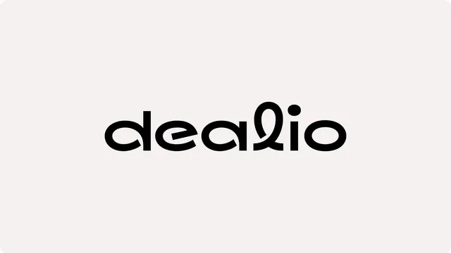
The Dealio wordmark set large and centered in black lowercase geometric sans on a warm off-white field, with a looped l and a cut-through e.
More like this
See all

Summary
A single-line lowercase wordmark presented in isolation, its character coming from two custom letterforms: an angled slice through the e and a curled, looping l.
Visual description
Warm off-white background with softly rounded corners, no border, no supporting text. The word "dealio" sits dead center at large scale in solid near-black, occupying about half the frame width and roughly a fifth of its height. The letterforms are geometric sans with near-monolinear strokes and circular bowls. The d has a straight full-height stem against a perfect circle. The e replaces the usual horizontal crossbar with a diagonal cut that opens the counter toward the lower right. The a is a single-storey circle with a stem. The l is the outlier: instead of a plain ascender it loops into a tall teardrop that crosses itself near the baseline. A separate circular dot floats above the i, and the closing o repeats the same circle as the d. Tight but even letterspacing throughout.
Key takeaway
Two custom cuts carry the whole mark. The angled slice in the e and the crossing loop in the l give an otherwise stock-feeling geometric sans a memorable silhouette, and because both moves are subtractive or single-stroke, the logo survives at small sizes.
Reuse notes
A clean model for a friendly consumer or marketplace app that wants approachability without novelty type. Presenting the mark alone on a warm neutral, not pure white, is what keeps it from reading cold. Note the loop on the l is the one shape that could collapse at favicon scale, so plan an alternate lockup or monogram for small use.