Preview image. Unlock full-res
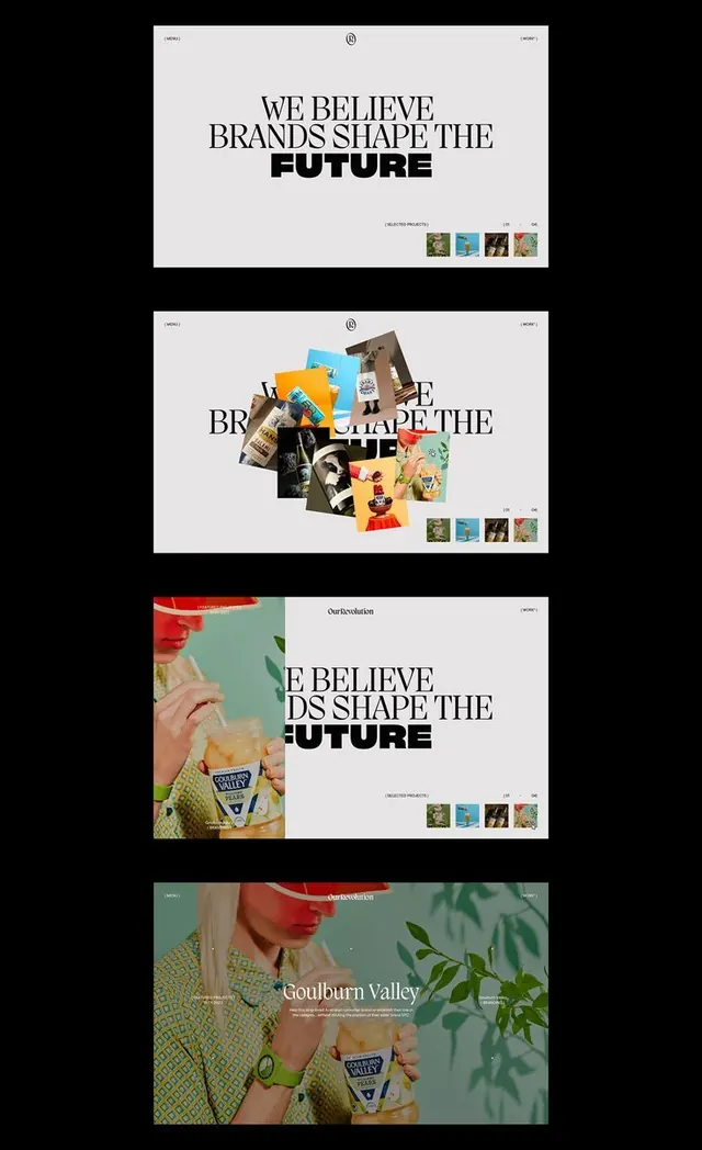
A modular brand identity for Goulburn Valley featuring black headline type, photography-led layouts, and colored accent elements across multiple applications.
Summary
A bold identity system for a food brand using oversized sans-serif caps, high-contrast photography, and a modular layout grid that shifts imagery placement across applications.
Visual description
Four layouts from a single brand system: top, a clean minimal application with the headline "WE BELIEVE BRANDS SHAPE THE FUTURE" in black sans-serif caps on white, centered with a small colored image stack below. Second, the same headline is disrupted by a burst of product photography and lifestyle images layered over the text, overlapping the type. Third, a split layout with warm-toned food photography on the left bleeding to the edge, paired with the headline and logo on the right in white space. Bottom, full-bleed photography of product packaging and hands holding food, with the brand mark and small text overlay. Black sans-serif caps throughout, aggressive oversizing of type, photography treated as both primary content and texture.
Key takeaway
The modular headline that tolerates image overlap without losing readability. The shift from minimal-white to photography-heavy applications shows how one identity scales. The color palette (earth tones, forest green, warm neutrals) read clearly even when competing with busy product shots.
Reuse notes
Strong for food/agriculture brands scaling from packaging to web to editorial. Works when you have photography worth featuring. Pair with structured grid systems to keep the chaotic overlaps intentional, not accidental. The all-caps bold type locks the aesthetic.
More like this




Keep what you find
A free account saves references to boards and can send you a weekly email of picks based on what you save.
To see every result, go Pro.