Preview image. Unlock full-res
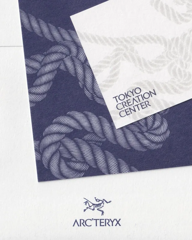
Brand collateral system pairing a hand-drawn woven rope pattern on navy with clean typography and light stationery applications.
Summary
Brand system pairing an organic hand-drawn woven rope pattern in white on navy with clean minimal sans-serif wordmarks for brand applications including stationery and signage.
Visual description
Layered composition showing folded navy and cream printed collateral. The dominant visual is a fluid, hand-drawn rope or knot motif repeated across navy paper in white lines, creating rhythm and texture. Two applications shown: Tokyo Creation Center wordmark set in tight, architectural sans-serif on cream card stock, and below it the Arc'teryx bird symbol with clean sans-serif logotype. The pattern flows across fold lines and edges, anchoring the system. Cream/off-white offsets the deep navy for high contrast and premium feel. Photography shows the pieces at an angle suggesting tactile, physical stationery.
Key takeaway
The pairing of an intricate, hand-drawn organic pattern with extremely minimal typography. The pattern acts as visual richness while type remains brutally restrained. Using the pattern across folds and edge treatments to create cohesion in a multi-piece system.
Reuse notes
Strong for luxury or crafted brands needing sophistication without ornamentation. The hand-drawn pattern works best at medium to large scale on collateral where the eye can resolve the detail. Navy plus cream is classic but works as an anchor for color extensions. Pattern-forward branding like this suits print-heavy identities more than digital-first applications.
More like this



Keep what you find
A free account saves references to boards and can send you a weekly email of picks based on what you save.
To see every result, go Pro.