Preview image. Unlock full-res
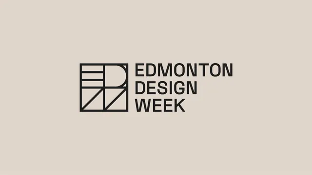
The Edmonton Design Week primary lockup, a line-built square monogram beside three stacked lines of caps grotesque, on warm stone.
More like this
See all
Summary
The identity's primary lockup shown alone on a warm neutral field: an outlined square monogram that packs E, D and W into one grid, set beside the name in three lines of caps.
Visual description
A flat warm stone background with the lockup centred slightly above the midline. On the left, a square drawn in a single consistent hairline weight, divided into quadrants: the upper left holds three horizontal bars forming an E, a large half-round bowl reads as a D across the right half, and two diagonals in the lower quadrants form a W. All strokes are the same weight as the outer square, so the mark reads as one continuous line drawing rather than three letters placed together. To the right, "EDMONTON DESIGN WEEK" is set in a neutral grotesque, all caps, medium weight, on three flush-left lines whose cap height and line spacing align with the divisions of the square. Everything is near-black on stone; there is no second colour, no descender and no tagline.
Key takeaway
Constructing the monogram from a single stroke weight on an explicit grid lets three letters share one square without any of them dominating. Matching the wordmark's three lines to the mark's internal divisions is what makes the lockup feel measured.
Reuse notes
The clean asset to reach for when studying grid-built monograms or three-line caps lockups for cultural and civic programmes. Hairline construction means it will fill in at small sizes or in embroidery, so a heavier secondary version would be needed for favicons, stitching and single-colour print.
More like this

Keep what you find
A free account saves references to boards and can send you a weekly email of picks based on what you save.
To see every result, go Pro.