Preview image. Unlock full-res
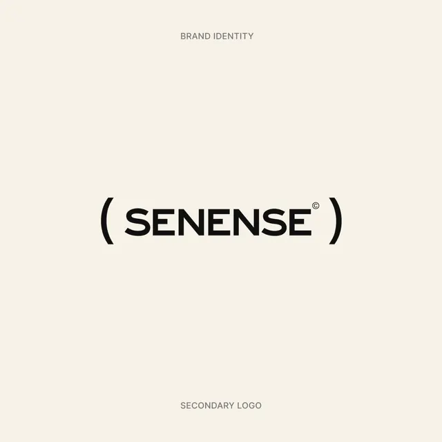
Bold all-caps sans-serif wordmark 'SENENSE' with parentheses framing, centered on a cream background with minimal secondary labels.
Summary
Minimalist identity system with bold all-caps "SENENSE" wordmark centered on cream, framed by parentheses and accompanied by spare hierarchy labels.
Visual description
Centered vertical layout on a warm cream background with black type and minimal secondary text. The primary wordmark is set in a bold, geometric sans-serif in all caps: "SENENSE" with a registered trademark symbol superscript. The text is enclosed on left and right by parentheses (curved brackets) that frame the wordmark tightly. Above the logo sits the label "BRAND IDENTITY" in small, light gray caps. Below sits "SECONDARY LOGO" in the same style. The composition exploits generous whitespace, with the middle third of the canvas occupied by the large primary mark, and substantial breathing room top and bottom.
Key takeaway
The parentheses frame device creates a subtle containment without a rigid box, adding personality to an otherwise austere layout. The hierarchy of labels (header + mark + footer) establishes a complete identity system on one canvas. All-caps sans-serif geometry reads as contemporary and refined.
Reuse notes
Excellent template for luxury goods, design-forward services, and contemporary corporate identities. The minimal palette works in print and digital. The parentheses bracket is distinctive and easy to apply across applications (signage, stationery, web). Works best with substantial whitespace in the final application.
More like this






Keep what you find
A free account saves references to boards and can send you a weekly email of picks based on what you save.
To see every result, go Pro.