Preview image. Unlock full-res
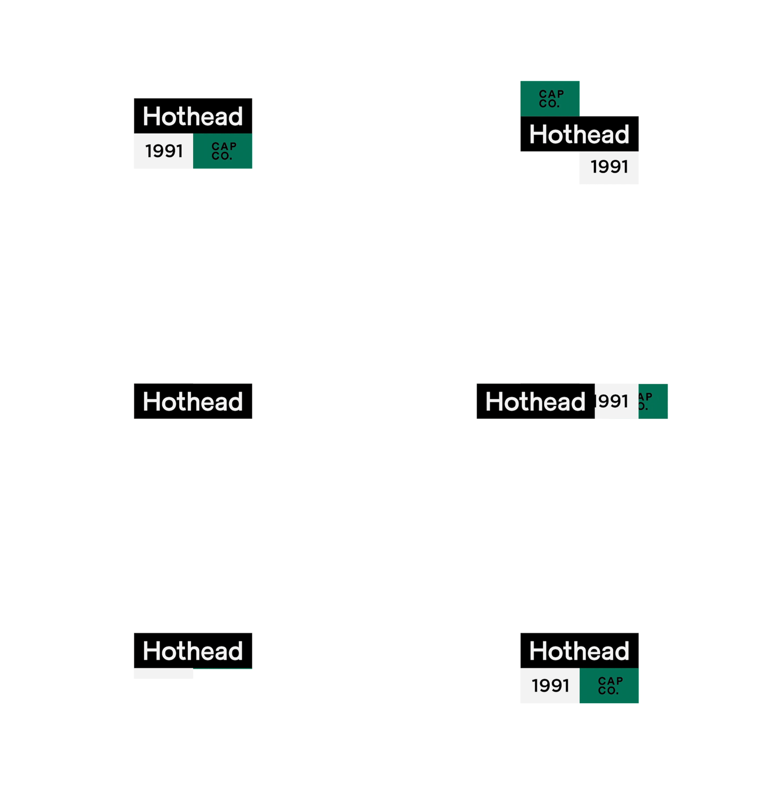
Modular logo for a cap company featuring black wordmark, gray year block, and teal company abbreviation arranged in a tight L-shaped grid.
Summary
Modular logo for a cap company featuring black wordmark, gray year block, and teal company abbreviation arranged in a tight L-shaped grid.
Visual description
The logo arranges three typographic elements in an asymmetric L-composition: a bold black sans-serif wordmark "Hothead" sits atop a light gray rectangular block containing "1991", with a teal square to its right printing "CAP CO." in compressed sans-serif capitals. The three-color palette (black, cool teal, neutral gray) creates clear hierarchy and separation between the brand name, founding year, and company descriptor. Dotted guide lines and precise geometric spacing suggest this is a reference specimen showing the logo's construction grid.
Key takeaway
The modular, grid-locked arrangement lets each element breathe while remaining visually linked. The teal accent provides a distinctive mark without overwhelming the black wordmark. Using a secondary color (gray) for metadata (year) avoids clutter while maintaining professional polish.
Reuse notes
Strong reference for construction-based logo systems, especially for heritage brands that want to signal establishment year or founding date. Works well in industries emphasizing tradition (apparel, manufacturing, established retailers). The L-layout adapts to horizontal or vertical lockups.