Preview image. Unlock full-res
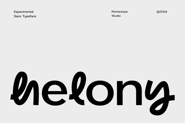
Type specimen showcasing an experimental sans-serif with flowing curves and organic letterform details on a minimal background.
Summary
A type specimen presenting Unkong, an experimental sans-serif with flowing organic curves and distinctive letterform details set large against generous white space.
Visual description
The word "Unkong" dominates the center-lower portion of a light gray background in oversized display weight. The letterforms blend geometric structure with organic flourishes: curved bowl forms with flowing tail strokes and hollowed counter-spaces create movement within each letter. The "U," "e," "k," and "g" each feature distinctive curved elements that suggest handwritten influence while maintaining sans-serif character. Minimal identifying text sits in the upper left (typeface name, studio, and 2024 date) in smaller regular weight. The composition emphasizes ample negative space around the specimen word, allowing the letterforms' details to read clearly.
Key takeaway
The balance between geometric structure and organic flowing details within individual letterforms. The use of hollow counter-spaces as formal design elements rather than functional necessities. Pairing a generous, minimal specimen layout with a single large word to let the typeface's character speak without distraction.
Reuse notes
Ideal reference for designing experimental or playful typefaces that need personality within sans-serif conventions. The flowing curves work well for branding systems seeking elegance with character. Effective specimen format for editorial or portfolio contexts. The 2024 date suggests recent design; treat as a contemporary example of blended geometric-organic typeface thinking.
More like this

Keep what you find
A free account saves references to boards and can send you a weekly email of picks based on what you save.
To see every result, go Pro.