Preview image. Unlock full-res
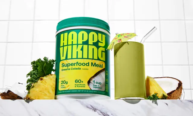
A single green shake tub on a marble counter against white tile, styled with a green smoothie, kale, pineapple and cracked coconut.
More like this
See all

Summary
A single-SKU hero still life that sets the pineapple and coconut flavour tub beside the made-up drink, styled like a tiki cocktail rather than a supplement.
Visual description
The tub sits just left of centre on a white and grey veined marble counter, photographed straight on with a grid of large white square tiles behind it. Its body is a deep forest green with a ribbed cap in a lighter teal green and a white collar. "HAPPY VIKING" fills the upper label in chartreuse, stacked over two tight lines in the heavy geometric sans with thin seams through the strokes and a small registered mark. The lower label is a bright yellow field carrying a sunburst of radiating lines, "Superfood Meal" and "Greeña Colada FLAVORED" in dark green, the three stat blocks, and a photographic crop of pineapple flesh and a coconut half at the right edge. Three green certification roundels including a B Corp mark run up the right side. To the right stands a tall straight-sided glass of opaque olive green smoothie with a clear bent glass straw and a small floral paper cocktail umbrella tilted over the rim. Props are staged tight to the counter edge: curly kale and a cracked coconut shell at the left, a pineapple wedge in front, and a second pineapple wedge, coconut half and kale sprig at the right. Lighting is soft and even, and the whole frame stays inside a green, yellow and white palette.
Key takeaway
Styling a functional nutrition product with holiday drink cues, the umbrella, the glass straw, the whole coconut, reframes a meal replacement as something you would want rather than something you should have. The label's yellow sunburst panel is picked up by the pineapple props, so the styling and the packaging share one colour story.
Reuse notes
Use for single-flavour hero shots, PDP imagery or a launch post where one SKU needs a personality of its own. The tile grid keeps the background bright without going seamless white, which suits food and beverage better than a studio sweep. The prop language is flavour specific, so it does not transfer to the chocolate or vanilla variants without a full restyle.