Preview image. Unlock full-res
A fifteen-slide brand identity carousel for ACE Resource Network, a national nonprofit addressing childhood trauma, featuring a comprehensive system of warm color, compassionate typography, icon patterns, and applied collateral mockups.

Summary
A comprehensive brand identity system for a trauma-informed nonprofit, spanning photography, typography, color palette, icon patterns, and real-world collateral applications, balancing strength and compassion in equal measure.
Visual description
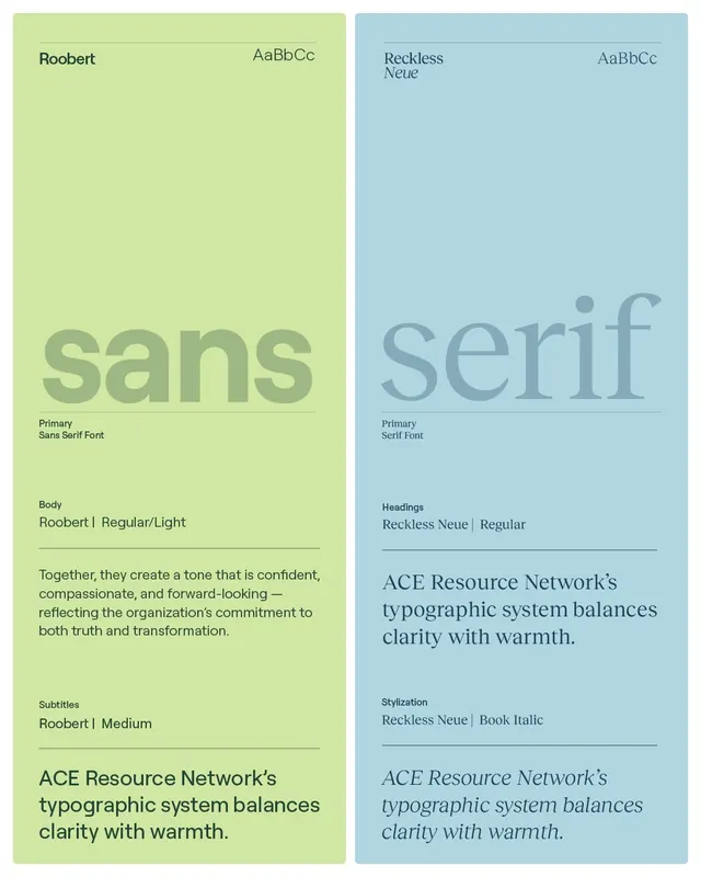
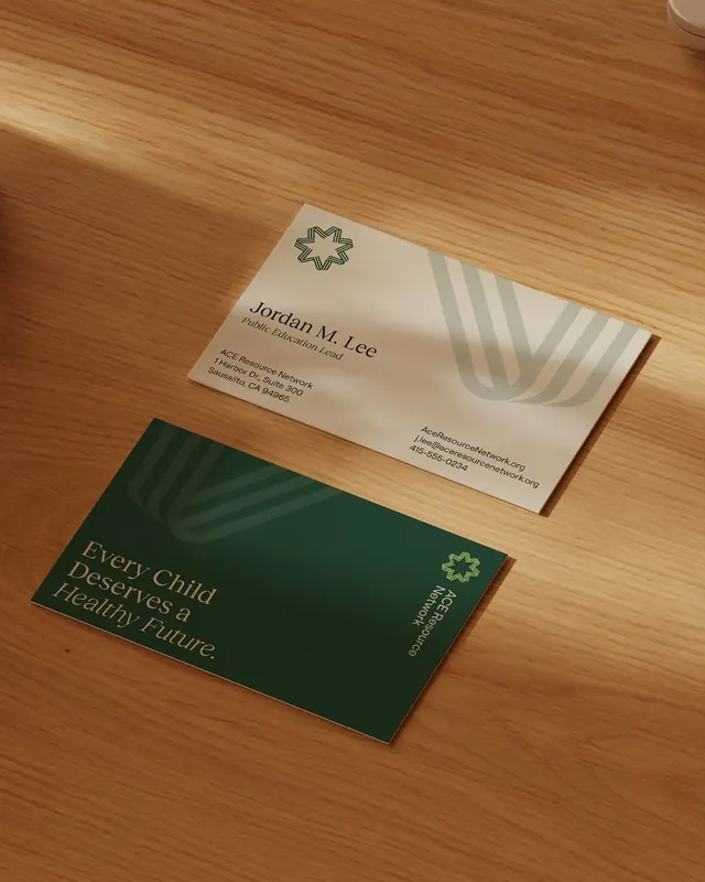
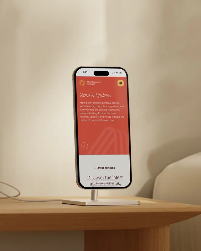
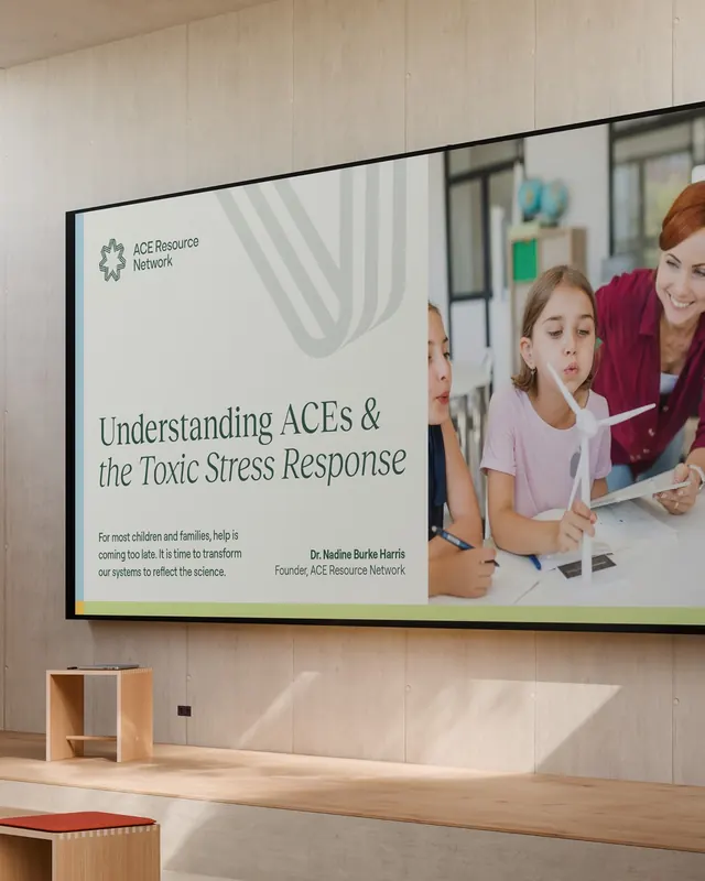
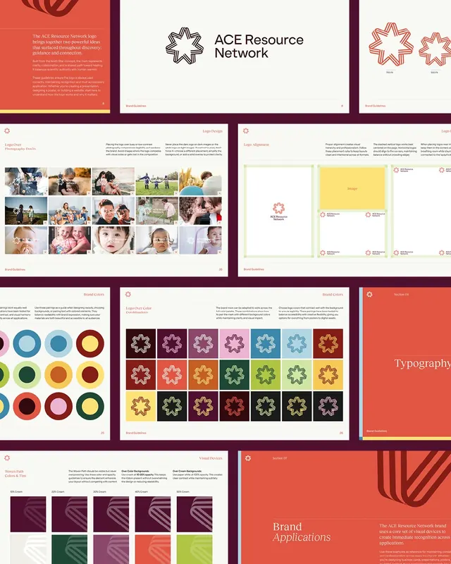
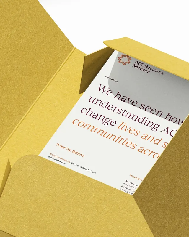
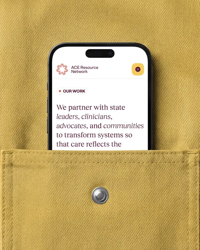
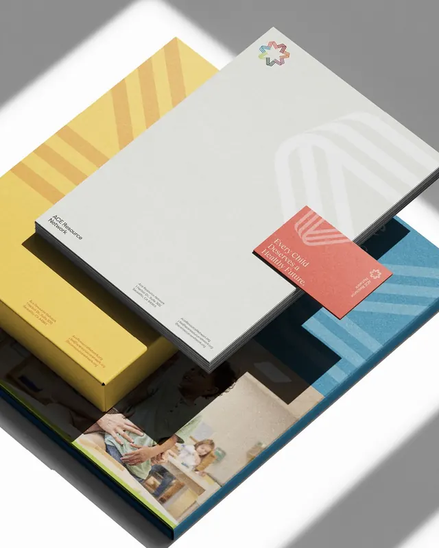
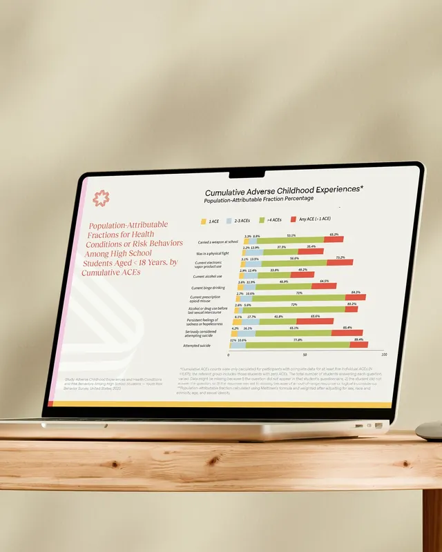
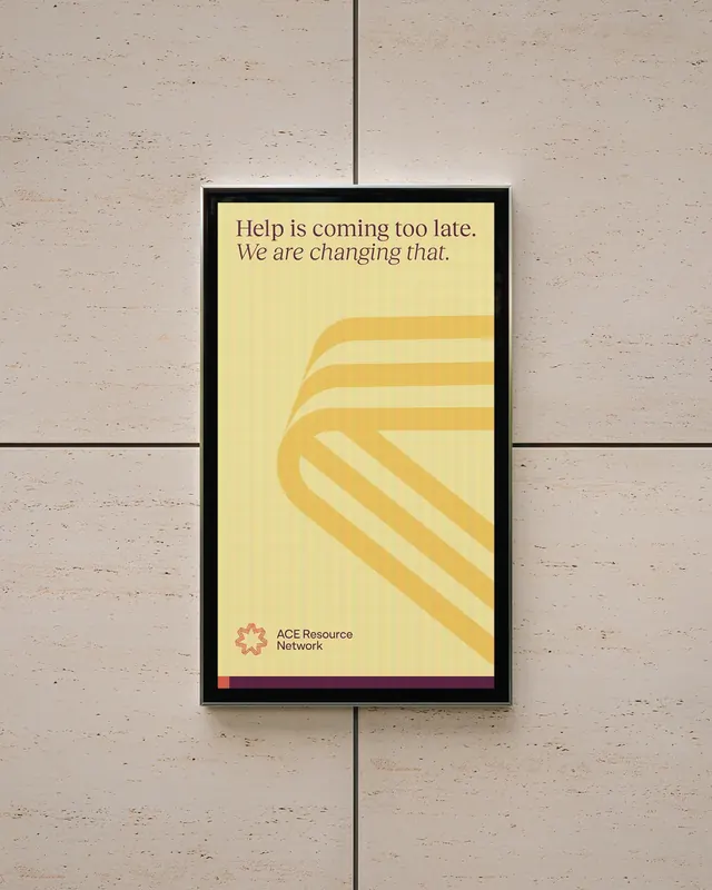
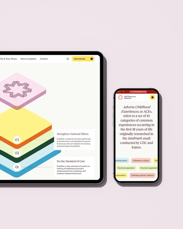
The carousel opens with intimate photography of children's faces, grounding the abstract mission in lived experience. The identity system includes a warm six-color palette anchored by mustard yellow, sage green, coral salmon, teal, navy, and lime green. Two complementary typefaces (Roobert sans-serif and Reckless Neue serif) work together to create a "confident, compassionate, forward-looking" tone. A geometric star icon system uses layered line patterns in multiple colors. Collateral mockups show the system applied to letterheads, business cards, printed folders, posters, marketing materials, and digital screens. Generous use of whitespace and subtle geometric stripe patterns creates visual breathing room. The photography and color palette work together to feel both institutional (capable, serious) and human-centered (warm, accessible).
Key takeaway
Strong identity work for mission-driven organizations balances professional credibility with emotional warmth. The dual-typeface approach solves the nonprofit tension between authority and approachability. The systematic use of patterns and color combinations allows flexible applications without losing cohesion.
Reuse notes
Excellent reference for nonprofits, social impact organizations, or cause-driven brands needing to project both competence and compassion. The color palette and pattern approach works well in printed collateral. The typeface pairing (sans + serif) is particularly effective for organizations needing both formal and friendly contexts. The photographic approach of showing real people rather than abstract concepts adds authenticity. Consider the warm palette saturation may be less flexible in contexts requiring stark corporate clean aesthetic.
From this post: ACE Resource Network brand identity case study
View post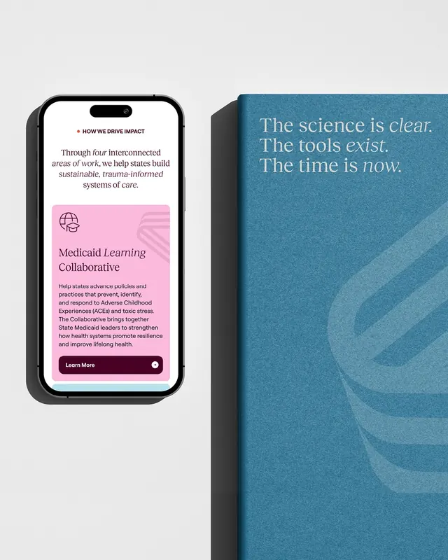

More like this




Keep what you find
A free account saves references to boards and can send you a weekly email of picks based on what you save.
To see every result, go Pro.