Preview image. Unlock full-res
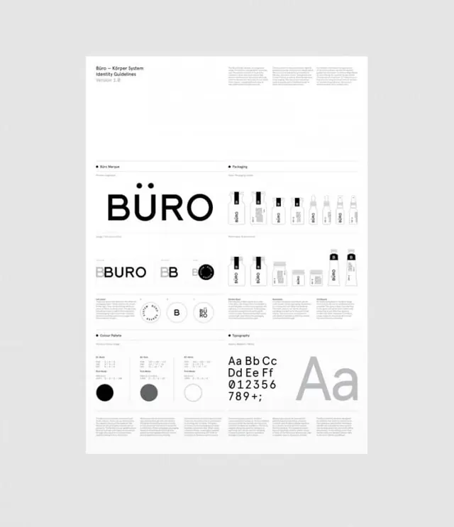
A comprehensive brand identity guidelines page showing the Büro logo mark, letterforms, color palette, and packaging application in a clean, modular layout with supporting documentation.
Summary
A professional brand identity system page for Büro that systematically documents the logo, wordmark variations, icon mark, packaging applications, and typography specifications in a strict modular grid layout.
Visual description
The page is organized into distinct sections with clear headers. The top left shows "Büro" as the main logo wordmark with "Identity Guidelines" subtitle. Icon variants are shown in a grid (including a solid circle and outlined circle versions). The central section displays large letterforms demonstrating the primary typeface. A color palette section shows three colors: black, gray, and white. The bottom right shows packaging applications with bottle illustrations. All text is set in a clean sans-serif, and the overall layout uses consistent spacing and alignment on a white background.
Key takeaway
The systematic modular grid approach makes the brand identity instantly understandable and easy to apply. The combination of logo, icon, color, and typography in one view demonstrates how to create comprehensive yet accessible brand guidelines.
Reuse notes
Excellent reference for corporate brand identity systems or when designing packaging brand guidelines. The Swiss-style grid layout and monochromatic palette work well for modern, professional brands requiring clarity and consistency. The clear hierarchical organization of logo, icon, color, and typography sections sets a strong template for guideline documentation.
More like this
Keep what you find
A free account saves references to boards and can send you a weekly email of picks based on what you save.
To see every result, go Pro.