Preview image. Unlock full-res
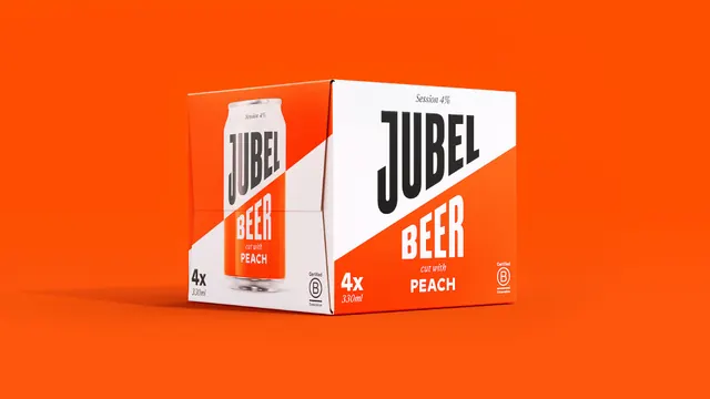
A single Jubel four-pack carton photographed at three quarters on a flat orange field, its front panel white and its side panel carrying a cropped can image.
More like this
See all
Summary
The four-pack shown alone on brand orange, using a tone on tone background so only the white half of the pack separates from the field.
Visual description
A cube carton sits centred on a seamless orange ground with a soft shadow pooling to the left. It is turned so both the front and left side panels are visible. The front panel is split by the brand diagonal: a white upper field with JUBEL in heavy condensed black caps, and an orange lower field with BEER reversed in white, then an italic serif cut with above a bold PEACH. Small marks sit at fixed corners, an italic Session 4% at the top, 4x over 330ml at lower left, and an outlined Certified B Corporation mark at lower right. The side panel carries the same diagonal with a photographic can standing in the white half, its own label diagonal continuing the line. Edges are crisp with visible board thickness at the top opening.
Key takeaway
Putting the pack on its own brand color so the orange half of the design merges with the background and only the white panel reads as an object. It makes a plain box shot look composed and forces attention onto the wordmark.
Reuse notes
A neat approach for hero pack photography where you want brand color to fill the frame without a lifestyle set. Requires the background to match the pack ink exactly, otherwise the two oranges fight. Not suitable for retailer asset libraries that mandate a white or transparent background.