Preview image. Unlock full-res
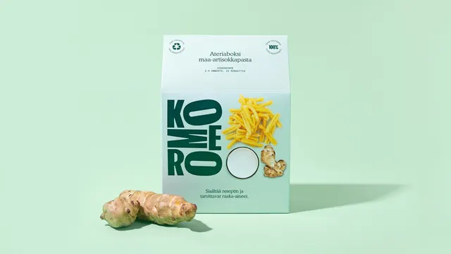
A single pale mint meal-kit carton on a mint sweep, its front panel pairing the stacked wordmark with cut-out shots of the actual ingredients.
More like this
See all
Summary
A hero pack shot of one meal-kit carton, where cut-out ingredient photography is nested into the gaps of the stacked wordmark instead of sitting in its own panel.
Visual description
One tall pale mint carton stands centered on a slightly deeper mint background, lit from the left so a soft shadow falls to the right and a subtle vertical gradient runs down the pack face. The top panel carries the product name in two lines of dark green sans, a smaller all-caps line of portion and cook-time detail, and two circular text-in-a-ring seals in the corners for recycling and satisfaction. The front panel sets the wordmark as a stacked block of oversized condensed letters filling the left half, with cut-out photography sitting in the open space to its right: a loose pile of yellow pasta, a plain white circle of sauce, and a knobbly jerusalem artichoke tuber that overlaps the final letter. A two-line sentence of dark green copy anchors the bottom of the panel. A real jerusalem artichoke lies on the surface in front of the box, echoing the cut-out above it and grounding the pack on the sweep.
Key takeaway
Letting the ingredient cut-outs interlock with the letterforms turns the wordmark into the layout grid, so the pack needs no boxes, rules or dividers. Repeating one hero ingredient as a real prop in front of its own cut-out is a quiet way to promise that what is pictured is what is inside.
Reuse notes
Good reference for a single-SKU pack shot where the product itself cannot be shown. The tone-on-tone mint keeps it calm but leaves very little contrast, so it needs the deep green type to carry legibility. Scale the wordmark down and the interlocking trick stops working.