Preview image. Unlock full-res
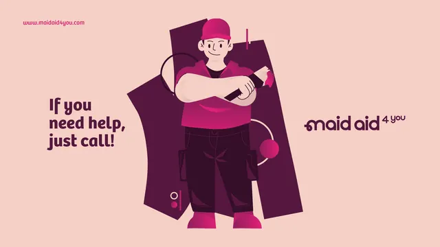
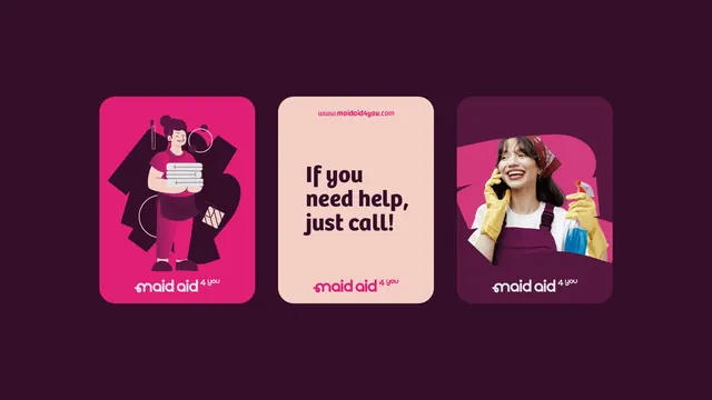
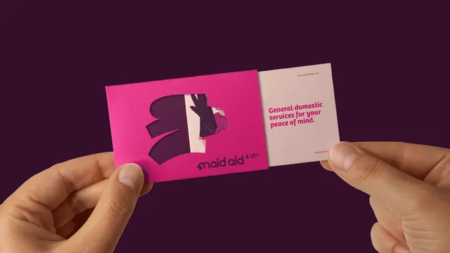
A logo animation in which a hot pink scribbled mass and a white lowercase wordmark draw themselves on together over a deep plum field.
More like this
See all
Summary
A build-on logo reveal: a hot pink scrawl and a white wordmark grow together from a single stroke into a compact centred lockup, held small against a large plum field.
Visual description
The frame opens as flat deep plum with nothing in it. A single rounded pink bar appears at a slight tilt, trailing a hard offset shadow in a darker plum, and the first letters of the wordmark fade in beneath it in white. From there both elements accumulate in step: more angled pink bars stack and overlap into a dense, hand-scrawled mass, while the lowercase wordmark reading maid aid types outward to the right and is joined by a small raised 4 you set at a jaunty angle. The type is a rounded geometric sans in white with a tight lowercase tail on the m. The finished lockup sits centred and occupies only a small share of the canvas, so the plum ground dominates. The offset shadow stays attached to the pink mass in the resolved state, giving the mark a shallow sticker-like lift.
Key takeaway
Building the mark and the wordmark on the same timeline, rather than revealing one then the other, makes an assembled logo feel drawn rather than animated. The hard offset shadow doing the depth work with two flat colours and no gradient is the cheap, reusable move here.
Reuse notes
A good template for a service brand that wants energy without illustration: scrawl plus rounded lowercase sans plus one loud pink on a deep neutral. The tiny lockup in a large field only works where the animation itself holds attention, so scale it up for a static application. The pink on plum pairing is high contrast but tonally close, so check it at small sizes and in print.