Preview image. Unlock full-res
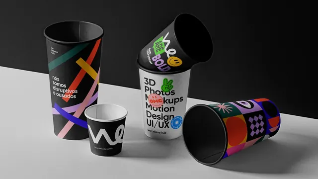
Four paper cups on a grey ledge showing four different We Believe Hub graphic treatments, from diagonal stripes to sticker-covered type.
More like this
See all
Summary
A staged product shot of four branded paper cups, each carrying a different graphic language from the same identity. The point of the frame is variety within one packaging item.
Visual description
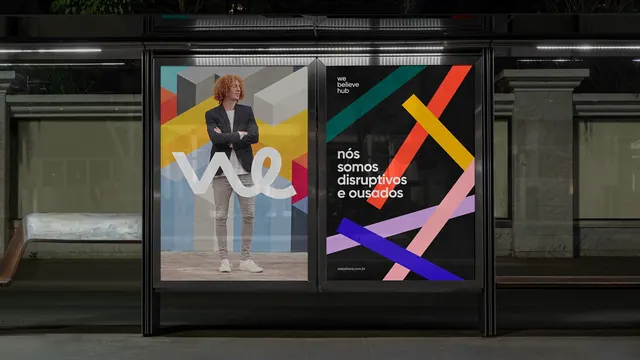
The scene is lit softly against a black back wall and a pale grey surface, with long shadows falling right. Standing tall at left is a black cup printed with thin diagonal ribbons in teal, red, yellow, pink, lilac and blue, plus the lowercase line "nós somos disruptivos e ousados" in white and a small "we believe hub" lockup near the rim. In front of it sits a small black espresso cup carrying the white script "we" monogram and the line "have the better coffee". Centre right, a white cup stacks the words "3D Photos Mockups Motion Design UI/UX" in heavy black sans-serif with circular stickers punched over them: a green peace hand, a red "OMG" smiley, a blue seal. Tipped into it at an angle is a black cup reading "we ARE BOLD AND DIFFERENT" with a yellow smiley. Lying on its side at right is a cup covered in a dense pattern of coloured blocks, checkers, circles and eye motifs in orange, purple, pink and teal.
Key takeaway
Four cups, four different levels of noise, from quiet monogram to full pattern wrap. Building a family that spans restraint to maximalism on the same object is what makes the system feel deep rather than decorated.
Reuse notes
Useful for coffee shop, studio or coworking merchandise where a single SKU has to express a whole identity, and as a photography reference for grouping objects at different heights and tilts. The dark backdrop with a pale ledge is doing a lot of the work; on a white set the black cups would lose their edges.