Preview image. Unlock full-res
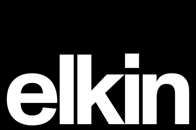
Geometric wordmark "elkin" in white sans-serif capitals set on black background.
Summary
The word "elkin" rendered as a geometric wordmark in white against pure black, with clean proportions and consistent stroke weight throughout.
Visual description
White sans-serif capitals spell "elkin" centered on a black background. The letterforms are geometric and modular, with uniform weight and spacing. The geometric construction emphasizes clean, functional letterforms with no decorative flourishes.
Key takeaway
Restraint and clarity through reduction. The pure black-and-white contrast and simple geometric forms create immediate visual recognition and strong brand presence with minimal effort.
Reuse notes
Effective as a primary brand mark for tech, design-focused, or minimalist brands. Works at any scale and reproduces cleanly in black and white. Strong choice for logos that prioritize clarity and memorability over ornamentation.