Preview image. Unlock full-res
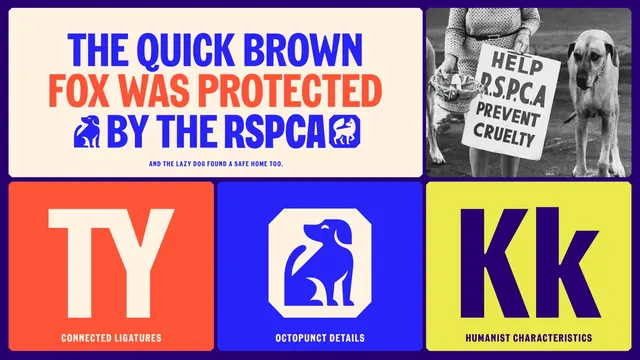
Five-panel specimen board showing a pangram, an archive protest photograph, and three close-up tiles annotating the typeface's ligatures, punch details and humanist forms.
More like this
See all
Summary
A specimen board that proves the custom typeface with a rewritten pangram, then isolates three letterform details on flat colour tiles beneath it.
Visual description
Five rounded rectangular panels sit on a deep purple ground in two rows. The wide cream panel at top left carries "THE QUICK BROWN FOX WAS PROTECTED BY THE RSPCA" in three centred all-caps lines, blue then orange-red then blue, with two octagonal animal marks set inline as if they were words. A small blue line underneath reads "AND THE LAZY DOG FOUND A SAFE HOME TOO." To its right, a black and white archive photograph shows a woman holding a hand-lettered "HELP R.S.P.C.A PREVENT CRUELTY" placard beside two dogs on a beach. The lower row holds three square tiles: orange-red with a cream "TY" ligature labelled "CONNECTED LIGATURES"; blue with the octagonal seated-dog mark labelled "OCTOPUNCT DETAILS"; acid yellow with a purple "Kk" labelled "HUMANIST CHARACTERISTICS". All labels are small all-caps with wide tracking.
Key takeaway
Rewriting the standard pangram into a sentence about the organisation's own mission makes a technical specimen carry brand meaning. Pairing the new letterforms directly with a period archive placard argues that the type is a continuation of the charity's history rather than a break from it.
Reuse notes
A clean template for presenting a bespoke typeface inside a brand guideline or case study: one hero setting, one proof point from the archive, three annotated details. Needs a typeface with genuinely distinctive features to justify the callout tiles; on a licensed face the same layout would feel hollow.
More like this




Keep what you find
A free account saves references to boards and can send you a weekly email of picks based on what you save.
To see every result, go Pro.