Preview image. Unlock full-res
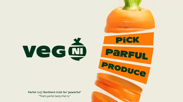
The Veg NI logo shown beside its strapline device, three orange bands wrapped around an exploded carrot, with a footnote defining the dialect word "parful".
More like this
See all
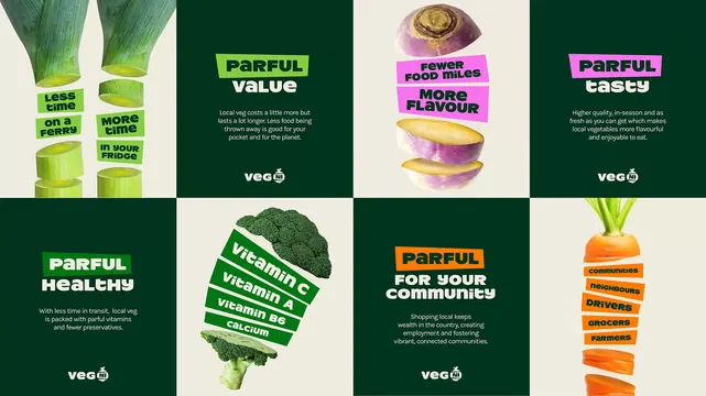
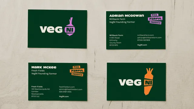
Summary
A landscape frame that puts the logotype on the left and the campaign strapline on the right, with a short glossary note explaining the local word the line is built on.
Visual description
The ground is warm off-white. On the left, "veg" is set large in a heavy dark green rounded sans with a low-slung lowercase g, followed by a solid dark green roundel shaped like a turnip or beet, complete with a knotted top leaf, holding the letters "NI" reversed out in white inside a thin outlined lozenge. On the right, a carrot is photographed cut into pieces with gaps between them, the leafy crown at the top and slices tumbling out of frame at the bottom. Across its middle sit three orange parallelogram bands, each rotated a few degrees, reading "Pick", "Parful" and "Produce" in the same heavy dark green all-caps. Bottom left, small dark green type reads "Parful (adj) Northern Irish for 'powerful'" with the parenthetical in italic, and beneath it an italic example sentence, "That's parful tasty that is."
Key takeaway
The identity leans on a regional word and then explains it in the artwork itself, which turns a potential barrier into the reason to look. The vegetable shaped roundel means the mark stays recognisable even when the letters inside are too small to read.
Reuse notes
Useful when a brand's distinctiveness comes from local language and the audience extends beyond the people who already use it. The glossary footnote only earns its space on hero assets; smaller formats need the lockup alone. The wrapped band device depends on a vegetable with a strong tapering silhouette.