Preview image. Unlock full-res
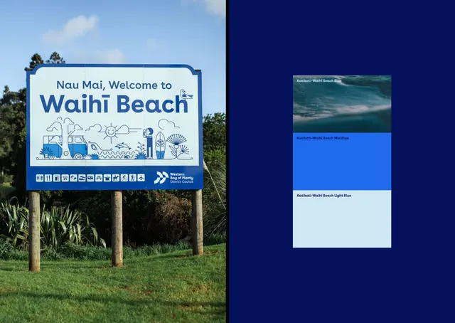
A split-panel design pairing an outdoor informational sign with a structured color and photography guide for a New Zealand tourism brand.
Summary
A physical wayfinding sign for Waihi Beach paired with a color-system reference panel demonstrating the brand's palette and photography style in cool, naturalistic tones.
Visual description
Left side: a roadside sign mounted on wooden posts set against a live landscape. The sign uses a light cream background with dark teal headline typography reading "Waihi Beach," a simple line-drawn icon system depicting beach activities (beach chair, umbrella, person), and a horizontal row of social icons at the base with a teal accent bar. Right side: a navy background holding a three-section card layout showing the coastal photography (green and sky), primary brand color (bright teal), and secondary light background, establishing the brand's environmental color language.
Key takeaway
The stacked color-swatch card on the right elegantly documents the brand's photographic palette and core colors in one compact reference. The left sign demonstrates effective icon integration and icon grid for public wayfinding. The overall composition uses contrast and hierarchy to present both the deployed artifact and its underlying system.
Reuse notes
Strong model for tourism or destination-brand systems that need to show environmental coherence. The color progression (dark, vibrant, light) is ideal for beach/outdoor verticals and works well in the wayfinding + reference-system format. Scale the card side for digital brand guidelines or stakeholder decks.
More like this





Keep what you find
A free account saves references to boards and can send you a weekly email of picks based on what you save.
To see every result, go Pro.