Preview image. Unlock full-res
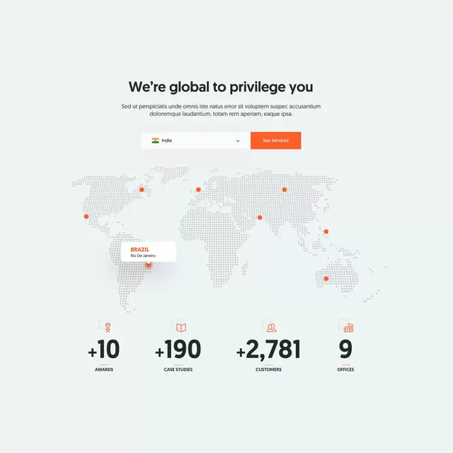
Minimal data visualization page with centered headline, world map dotted with location markers, and four large stat numbers indicating global reach and scale.
Summary
A minimal B2B stats section with the headline "We're global to privilege you", a grayscale world map showing twelve coral-orange location dots, and four large metric numbers below highlighting growth and reach.
Visual description
Light gray background with centered, modest headline text and brief supporting copy. Below, a simplified grayscale world map outline with coral-orange circular markers plotted at key geographic points. The markers have minimal drop-shadow depth. Below the map sit four large metric blocks displayed as numbers with labels: "+10 months", "+190 use cases", "+2,781 customers", "9 venues". Each number is in a warm orange or tan shade with gray labels underneath. Layout is centered and vertically stacked, making heavy use of white space between sections. Typography is clean sans-serif throughout. The color palette is predominantly soft neutrals with strategic orange accents to draw attention to the data.
Key takeaway
The technique of embedding data points directly on a map to convey global presence without overwhelm. The oversized number treatment makes metrics instantly scannable. The restrained orange accent stands out against the neutral palette. Soft drop-shadow on the location markers adds subtle dimensionality.
Reuse notes
Works for B2B SaaS, consulting, or international service providers demonstrating geographic reach. The minimal aesthetic keeps focus on the numbers. The map simplification makes it printable and web-friendly. The four-stat layout is a standard pattern for showcasing company scale or customer reach.
More like this
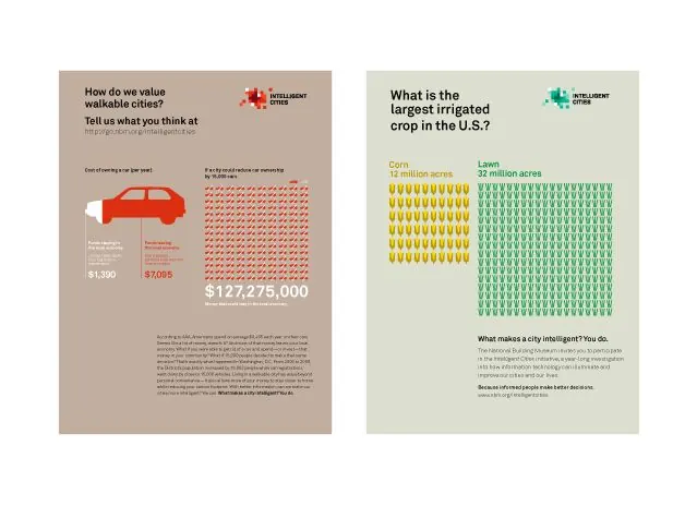
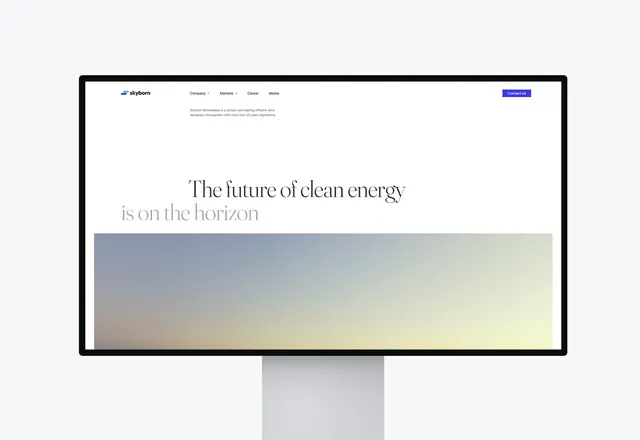

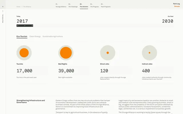

Keep what you find
A free account saves references to boards and can send you a weekly email of picks based on what you save.
To see every result, go Pro.