Preview image. Unlock full-res
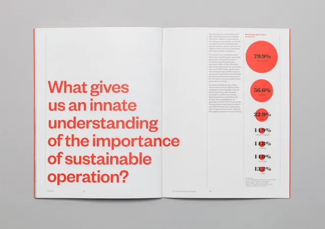
Minimal corporate report layout with coral-red question headline on light gray background, accompanied by a small vertical icon column suggesting environmental or operational metrics.
Summary
Minimal corporate report layout with coral-red question headline on light gray background, accompanied by a small vertical icon column suggesting environmental or operational metrics.
Visual description
Left-aligned composition with generous white space. Bold coral-red sans-serif headline reads 'What gives us an accurate understanding of the importance of sustainable operation?' positioned on light gray field. Right side displays a vertical stack of five small circular icon badges in varying sizes and fills, graduating from solid coral-red (top) through smaller filled circles to outline strokes at base, suggesting data hierarchy or impact levels. No body text visible; the layout prioritizes the question and abstract metrics column.
Key takeaway
The visual equation of the icon stack to data communication: graduated circles suggest measurement, increase, or weighted importance without requiring a legend. Asking a question as the primary typographic element invites engagement on reports and compliance documents. The coral accent on neutral gray is energetic without being alarm-driven, appropriate for energy and sustainability contexts.
Reuse notes
Suited to corporate sustainability reports, energy efficiency documents, B2B case studies on environmental impact, and internal stakeholder briefings. The question-format headline works well when you want to frame a topic as a problem to solve rather than a statement. The icon stack is abstract enough to represent any metric (carbon, energy, water, waste, diversity); pairing it with specific labels in a larger layout would clarify meaning.
More like this



Keep what you find
A free account saves references to boards and can send you a weekly email of picks based on what you save.
To see every result, go Pro.