Preview image. Unlock full-res
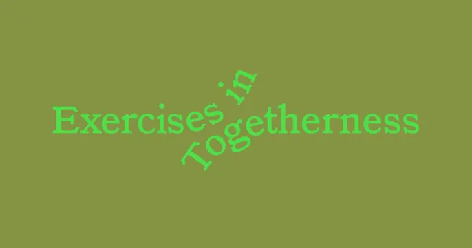
Overlapping, hand-drawn type spelling 'Exercises Toughness' with scattered smaller words rotated at angles, set against a muted olive-green background.
Summary
Overlapping, hand-drawn type spelling "Exercises Toughness" with scattered smaller words rotated at angles, set against a muted olive-green background.
Visual description
A soft, sage-green full-bleed background with bright lime-green hand-drawn sans-serif text layered in the center-left, some letters tilted or off-axis. The primary phrase stacks and overlaps, with secondary words (likely "is" or similar) rotated 45-60 degrees around it, creating dynamic rhythm without chaos. Generous negative space surrounds the composition, keeping the eye focused on the text forms themselves. The handwritten quality suggests a brush or marker stroke, while remaining legible at any scale.
Key takeaway
The combination of a restrained color palette (just two greens on one background) with playful typographic arrangement (rotation and overlap) creates approachability without sacrificing calm. This technique works for wellness, therapy, or lifestyle brands that want personality without aggression. The handwritten type weight conveys sincerity.
Reuse notes
Well-suited for healthcare, fitness, mental-health, or lifestyle campaigns. The rotated-text trick works best when the primary phrase is readable at a glance; reserve secondary words for accent rotation. Pairs naturally with organic illustrations, soft photography, or body-positive messaging. Avoid on small screens where rotation may reduce legibility.
More like this



Keep what you find
A free account saves references to boards and can send you a weekly email of picks based on what you save.
To see every result, go Pro.