Preview image. Unlock full-res
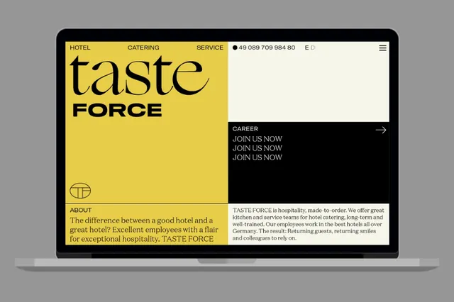
Hotel and catering company website mockup using split-screen layout with bold yellow panel and dark typography-led information architecture.
Summary
A hospitality brand website showcasing a split-panel layout with golden-yellow branding on the left and dark typography-rich information on the right, emphasizing hierarchy and specialization.
Visual description
The website mockup is displayed on a dark gray background. The viewport splits vertically: the left panel is a bold, saturated golden-yellow field containing the "taste FORCE" logotype (lowercase serif "taste" above bold caps "FORCE") and a simple geometric logomark (concentric circles with horizontal bar). The right panel is divided into three horizontal zones: a top third with white text on black, a middle third with dark text on yellow, and a bottom third with dark text on white/cream. The top-right section contains navigation (HOTEL, CATERING, SERVICE with a phone number and language toggle) and a right-arrow-marked "CAREER" button with repeated text "JOIN US NOW JOIN US NOW JOIN US NOW" vertically stacked. The middle-right displays "ABOUT" with body copy in a serif-sans serif mix: "The difference between a good hotel and a great hotel? Excellent employees with a flair for exceptional hospitality. TASTE FORCE" (the brand name and positioning sentence are highlighted in yellow). The layout is grid-based, using thirds and halves to organize content zones.
Key takeaway
The bold monochromatic split (yellow/black/white) creates instant visual separation between brand identity and information hierarchy. Using a single warm accent color across navigation, highlights, and emphasis creates coherence without pattern or imagery. The typography-first approach lets the typeface pairings and spatial arrangement do the design work. This layout scales well from desktop to tablet due to its grid-proportioned simplicity.
Reuse notes
Ideal for service-industry brands (hospitality, events, catering, culinary) that want to project precision and professionalism. The split-screen layout works especially well when one side needs to be devoted to branding and the other to navigation or descriptive content. The monochromatic color palette with a warm accent reduces production costs and renders consistently across browsers. Works best for brands with strong logomarks and clear typographic voice. Less suitable for image-heavy or portfolio-focused brands; this approach prioritizes text hierarchy and structured information.
More like this



Keep what you find
A free account saves references to boards and can send you a weekly email of picks based on what you save.
To see every result, go Pro.