Preview image. Unlock full-res
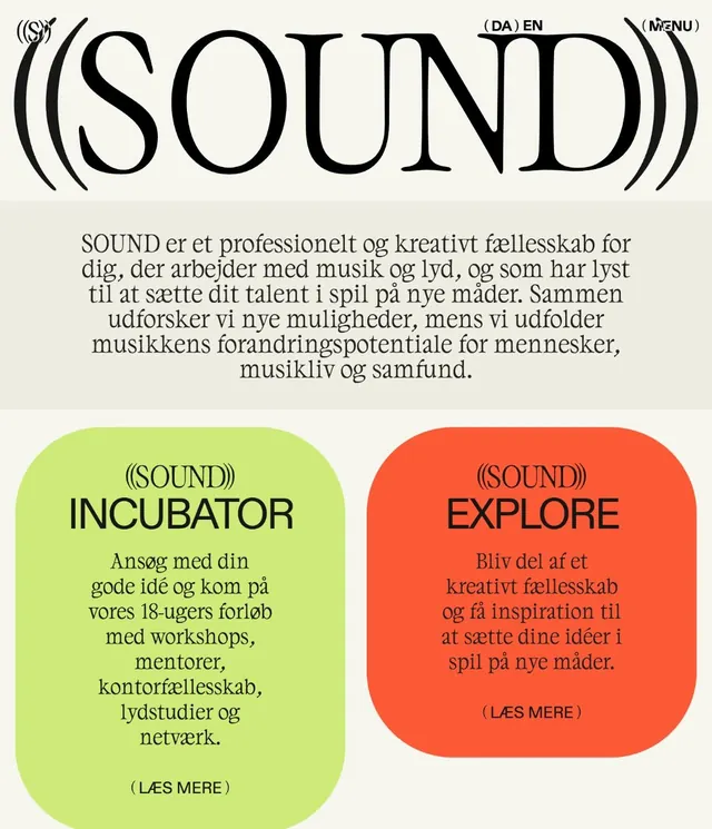
Two-column card layout in Danish introducing a creative music fellowship, with lime-green and coral-red color-blocked panels, bold black sans-serif type, and rounded corners.
Summary
A promotional two-card layout for a Danish creative fellowship, contrasting lime-green and coral-red panels, each with a distinct call-to-action (Incubator and Explore).
Visual description
Cream-white background with a centered serif headline "SOUND" with decorative brackets, accompanied by "(DA) EN" and menu notation top-right. A paragraph of justified serif Danish text below describes the organization. Two tall rounded-rectangle cards sit below: the left in vibrant lime-green, the right in warm coral-red. Each card displays "(SOUND))" label in brackets, bold black sans-serif headline ("INCUBATOR" left, "EXPLORE" right), followed by 4-5 lines of body text in black serif, and a "(LAES MERE)" (Read More) link at the bottom. The lime-green and coral-red pair creates a vibrant, youth-forward energy while the rounded card corners and justified text create a contemporary, approachable feel.
Key takeaway
The dual card format allows two distinct pathways (entry vs. discovery) to coexist without competing for attention, each anchored by its own color. The pairing of a highly saturated lime against a warm coral creates an energetic contrast that reads as playful without sacrificing legibility. Rounded corners soften the geometry, making the call-to-action feel less transactional and more inviting.
Reuse notes
Effective for community-driven or fellowship programs that want to present multiple entry points (mentor vs. participant, beginner vs. advanced). The card approach works well for languages with varied copy length since each card scales independently. The bright color palette suits music, creative, or youth-focused contexts. Consider this pattern for dual CTAs where you want the user to make a choice rather than feel funneled down one path.
More like this





Keep what you find
A free account saves references to boards and can send you a weekly email of picks based on what you save.
To see every result, go Pro.