Preview image. Unlock full-res
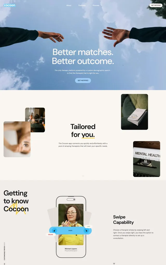
Healthcare landing page featuring two hands reaching across a blue sky, anchored by a personality-driven design system with product mockups and personalized feature cards.
Summary
Healthcare SaaS landing page using a two-hands reach across blue sky as the hero metaphor, paired with aligned product screenshots and feature callouts showing personalization and matching.
Visual description
The page opens with a dramatic hero: two hands reaching across a light blue sky dotted with clouds, with the headline "Better matches. Better outcome." A secondary CTA button sits below. The middle section transitions to a warm beige background and features three aligned product cards showing real use cases (close-up photography of faces, physical wellness items, a mental health feature card). A bottom section introduces the brand "Cocoon" with a playful illustration of a user with a smiley face avatar, anchored by a "Swipe Capability" feature description. The entire layout uses generous negative space, consistent sans-serif sizing and weight, and a restrained cool palette of mid-blue and neutral grays that reinforces trust and clarity.
Key takeaway
The two-hands hero as an inclusive, human-centered metaphor. The grid of product feature cards scaled by varying image sizes, creating visual rhythm while remaining balanced. The vertical reading order that moves from emotional hook (sky + hands) through concrete features to brand personality.
Reuse notes
Strong default for mental health, wellness, and healthcare matching platforms. Works best when you have good product photography or app UI to anchor the middle section. The gesture metaphor is versatile across care, community, and connection-focused verticals.
More like this



Keep what you find
A free account saves references to boards and can send you a weekly email of picks based on what you save.
To see every result, go Pro.