Preview image. Unlock full-res
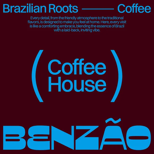
Coffee house branding on deep maroon background with bright cyan sans-serif headlines, parenthetical quote marks, and descriptive tagline stacked in minimal centered layout.
Summary
Coffee house branding system using bright cyan sans-serif type on deep maroon, with multi-level typography hierarchy (headline, parenthetical quote marks, descriptive tagline, and bold brand name) arranged in centered stack.
Visual description
Deep maroon background with cyan sans-serif typography in three distinct layers. Top section: a small linked phrase "Brazilian Roots - Coffee" in all-caps. Middle section: the coffee house name "Coffee House" in large cyan sans-serif, flanked by curved parenthesis marks in matching cyan. Below: a centered descriptive tagline in smaller cyan text explaining the coffee house's atmosphere and Brazilian heritage. Bottom: the brand name "BENZAO" in oversized cyan all-caps sans-serif with a wavy accent mark over the final "O". The composition is strictly centered and vertically stacked, using only two colors for maximum contrast and clarity.
Key takeaway
The tiered typographic approach groups information by importance and visual mass without resorting to size alone. The oversized brand name anchors the bottom and creates memorable impact. Cyan-on-maroon offers high legibility and a contemporary, energetic feel unusual for coffee branding, suggesting personality over formality.
Reuse notes
Effective for food and beverage brands targeting younger or design-conscious audiences. The dark background makes the bright type glow and can work well on small formats (cup sleeves, signage) and digital displays. The described atmosphere copy is character-building; adapt this voice to match your brand's storytelling goals.
More like this





Keep what you find
A free account saves references to boards and can send you a weekly email of picks based on what you save.
To see every result, go Pro.