Preview image. Unlock full-res
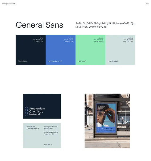
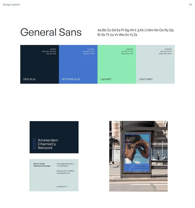
Type specimen showcasing a sans-serif family paired with a four-swatch corporate color palette in navy, blue, mint, and light gray.
Summary
A type specimen for General Sans paired with a corporate color palette and supporting graphic examples, anchored by a four-swatch system in navy, blue, mint, and light gray.
Visual description
The layout is divided into discrete sections: a header naming "General Sans" with a line of gray alphabetic reference, followed by four solid color swatches (deep navy, bright blue, vibrant mint, pale gray) each labeled with their color role. Below, a dark navy card shows "Architecture Choreography Research" in white caps and serif; an adjacent light teal card holds descriptive copy and small serif text. To the right, a photograph of someone in blue clothing beside a water feature anchors the bottom half. The overall grid is clean and orderly, using generous whitespace.
Key takeaway
The four-color system presented as discrete swatches makes it immediately clear how the palette applies to identity work. The combination of color blocks with a dark callout card plus casual imagery shows how type and palette work in real context without overcomplicating the presentation.
Reuse notes
A strong template for any corporate identity or design-system spec sheet. Works for consulting, healthcare, or B2B brands needing to establish trust through cool, calm color and clear typography. Scale the swatch sizes if your palette is larger.
More like this


Keep what you find
A free account saves references to boards and can send you a weekly email of picks based on what you save.
To see every result, go Pro.