Preview image. Unlock full-res
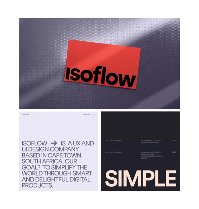
A four-panel layout combining a skewed red card with italic black sans-serif logotype, descriptive text block, and a dark panel featuring a single bold word.
Summary
A four-panel design composition showing a skewed red card with italic black sans-serif logotype (isoflow) atop a textured gray background, paired with a light text block and a black panel featuring the word SIMPLE in bold sans-serif.
Visual description
Top half: a photographic mockup showing a bright red rectangular card tilted in perspective on a dark textured woven or mesh background, casting subtle shadows. Black sans-serif display type reading "isoflow" in italic sits centered on the red, creating stark contrast. Bottom half divided into two equal quadrants: left side features a light lavender background with small gray body text describing the brand (isoflow is a UX and UI design company...), right side is solid black with the word "SIMPLE" in large white sans-serif, flush left. The overall composition is a 2x2 grid where the upper-left dominates visually.
Key takeaway
The red-on-dark contrast strategy showing maximum legibility with minimal color; the tilted/skewed perspective on a textured background adding dimension to flat type; the pairing of italic display logotype with supporting copy and a contrasting secondary statement word for a modular design system feeling.
Reuse notes
Effective for design studio or tech company presentations where brand confidence is paramount. The mockup approach grounds the logotype in a tactile context. The lavender-and-black quadrant split works as a template for pairing case study or value-proposition copy. Red accent works best on neutral or dark backgrounds for this high-contrast impact.
More like this


Keep what you find
A free account saves references to boards and can send you a weekly email of picks based on what you save.
To see every result, go Pro.