Preview image. Unlock full-res
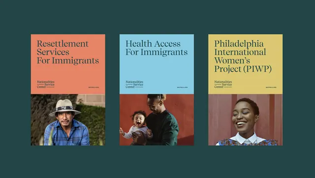
Triptych of service cards for immigrant-focused nonprofits, each pairing a colored header with a portrait and small descriptive text below.
Summary
Triptych of service cards for immigrant-focused nonprofits, each pairing a colored header with a portrait and small descriptive text below.
Visual description
Three vertical cards arranged horizontally on a dark teal background. Each card has a colored header (coral, light blue, pale yellow) with a service title in serif type, followed by a cropped portrait photograph of a person and minimal text in a sans-serif font below. The cards use warm and cool earth tones: the outer cards feature cooler teal/teal borders, the leftmost is coral, the center light blue, the rightmost pale yellow. The portraits show diverse individuals in natural lighting. Thin ruled lines separate each section within the card structure. The composition reads as documentary photography paired with institutional branding, emphasizing accessibility and straightforward information hierarchy.
Key takeaway
The color-coding per service (coral, blue, yellow) as a quick visual differentiation system. The pairing of portrait + title + text as an identity-affirming unit. The restraint in typography and spacing, keeping the focus on the people and service names.
Reuse notes
Strong for nonprofit or government service communications targeting diverse communities. Works especially well when each service needs distinct visual ownership within a system. The portrait-heavy composition builds trust and human connection in institutional contexts.
More like this

Keep what you find
A free account saves references to boards and can send you a weekly email of picks based on what you save.
To see every result, go Pro.