Preview image. Unlock full-res
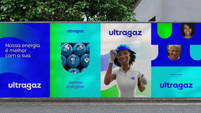
Corporate identity applied across horizontal segments in distinct brand colors, pairing portrait photography, product imagery, and typography in clearly separated zones.
Summary
Ultragaz brand system shown across horizontal color-blocked segments combining photography, logo, and type to present corporate identity on a building facade or wall mount.
Visual description
A horizontal billboard or wall installation displays the Ultragaz brand across five distinct color zones. From left to right: a deep blue panel with white text ("Nossa energia é energia do Brasil"); a green panel showing a detail photo of gas cylinders; a teal central section with the "ultragaz" wordmark and additional text blocks; a blue panel with a portrait photo of a person gesturing; and a returning teal panel repeating the logo. Each segment sits at the same vertical alignment, creating a unified band. All text is sans-serif, using consistent type sizing and weight. The color progression moves between deep blue, bright teal, and forest green without jarring transitions. Imagery is cropped tightly within each zone, showing product and person without bleeding across boundaries.
Key takeaway
The segmented horizontal system as a way to present multiple information layers (mission statement, product, brand mark, human element, reinforcement). The tight alignment of each segment at a consistent vertical baseline despite different content types. The color harmony built on two or three primaries used consistently across all zones to maintain identity while creating visual interest.
Reuse notes
Strong for utilities, energy, infrastructure, and service-heavy industries where you need to communicate scale, human touch, and product simultaneously. Works well on facades, large displays, and multi-screen installations. Keep type sizing consistent across segments even when content density varies.
More like this

Keep what you find
A free account saves references to boards and can send you a weekly email of picks based on what you save.
To see every result, go Pro.