Preview image. Unlock full-res
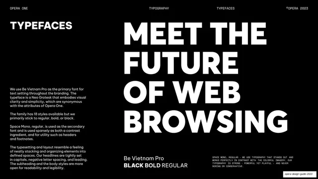
Typeface overview with body copy left, a giant all-caps "MEET THE FUTURE OF WEB BROWSING" specimen right, and primary/secondary font notes below.
Summary
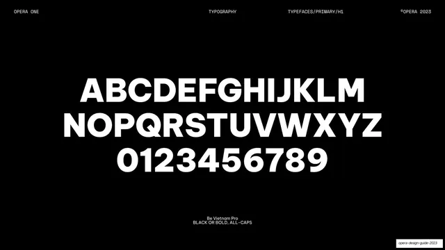
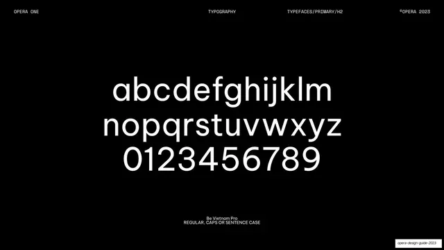
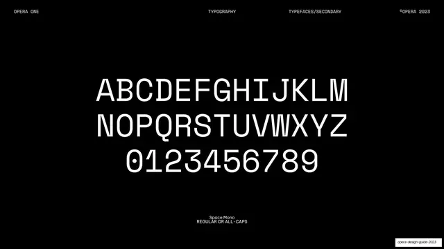
The typeface page naming Be Vietnam Pro as primary and Space Mono as secondary, anchored by a giant headline specimen.
Visual description
Pure-black background, monospace header (OPERA ONE / TYPOGRAPHY / TYPEFACES / ©OPERA 2023). The left third holds a "TYPEFACES" heading and four paragraphs of white body copy: Be Vietnam Pro as the primary Neo Grotesk, its 18 styles (mostly regular/bold/black), Space Mono as the sparingly-used secondary contrast font, and notes on tight capitalized headlines versus open body. The right two-thirds are filled by a giant four-line all-caps specimen, "MEET THE / FUTURE / OF WEB / BROWSING", in Be Vietnam Pro. A bottom-left label reads "Be Vietnam Pro / BLACK BOLD REGULAR"; a bottom-right monospace block credits Space Mono.
Key takeaway
Letting the primary typeface state its own case by setting the brand line huge as the specimen, while the secondary monospace shows up only in the small utility captions, so the page demonstrates the exact hierarchy it describes.
Reuse notes
A reusable typeface-overview page. Showing the headline face at poster scale and the mono face only in small print embodies the type system rather than just listing it. Strong font pairing reference: Neo Grotesk plus monospace.
From this deck: Typefaces Be Vietnam Pro and Space Mono
View deck



More like this





Keep what you find
A free account saves references to boards and can send you a weekly email of picks based on what you save.
To see every result, go Pro.