Preview image. Unlock full-res
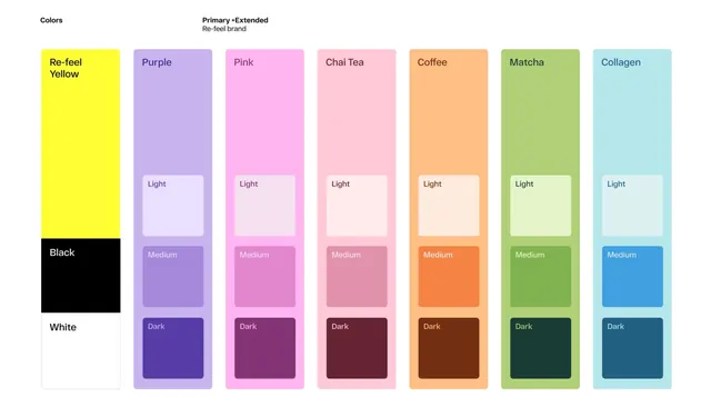
A comprehensive color palette specification for the Re-feel brand showing primary and extended colors with light, medium, and dark tints.
Summary
A design system color palette specification for Re-feel brand showing primary and extended color variations with semantic naming and three tonal levels (light, medium, dark) for each hue.
Visual description
A clean, documentation-style layout presenting a color palette on a white background. Left column displays core colors: Re-feel Yellow (bright), and Black/White foundations. Seven columns follow, each representing a color family (Purple, Pink, Chai Tea, Coffee, Matcha, Collagen). Each color column is subdivided into three rows: Light (tinted), Medium (satured), and Dark (darkened) versions. All colors are named and contained within crisp rectangular blocks. The sans-serif typography and grid layout create a professional, technical appearance.
Key takeaway
Systematic color naming (inspired by everyday objects and experiences) makes a palette more memorable and usable across teams. Showing tints and shades of each base color demonstrates the full range available without expanding the base palette unnecessarily.
Reuse notes
Useful as a reference for color specification in design systems. The semantic naming approach (Chai Tea, Coffee, Matcha) is more memorable than hex codes and appeals to lifestyle and wellness brands. Works for digital products, motion design, and brand extension guides. The seven-color extended palette is versatile enough for most design needs without overwhelming options.
More like this



Keep what you find
A free account saves references to boards and can send you a weekly email of picks based on what you save.
To see every result, go Pro.