Preview image. Unlock full-res
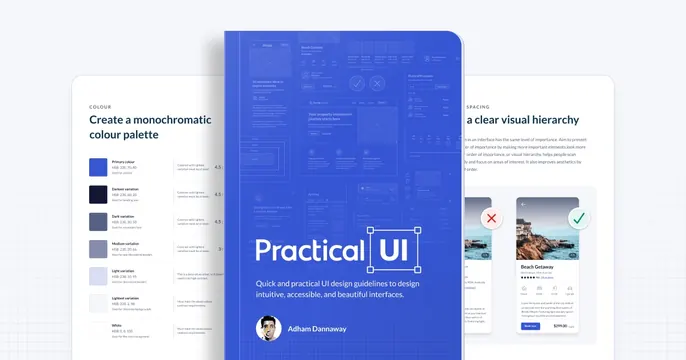
OG card for a UI design book, showing a blue cover page flanked by faded interior guideline spreads on white.
Summary
OG card for a practical UI design book where a bright blue cover page sits dead center, flanked by two faded interior pages that preview the book's actual guideline content.
Visual description
A white canvas holds three overlapping page mockups. The central card is a tall royal-blue cover bearing the "Practical UI" wordmark in white, a one-line description below, and an author byline ("Adham Dannaway") with a small round avatar at the bottom. Behind it, partly cropped, sit two near-white interior spreads: on the left a "COLOUR" page titled "Create a monochromatic colour palette" with a stacked list of swatch rows and HSB values; on the right a "SPACING" page titled "a clear visual hierarchy" with dense body copy and a pair of property-card wireframes (a rejected and an approved listing). Type is a clean dark sans throughout; the blue cover is the only saturated element.
Key takeaway
Selling a content product by stacking its real interior pages behind the cover, so the card both brands and demonstrates. The single saturated cover against muted flanking pages creates instant focus without any background treatment.
Reuse notes
Strong template for an ebook, course, or template-pack launch where the actual pages are the proof. Needs genuinely attractive interior spreads to work. The layered-page look reads best on a plain light ground; busy interiors can get noisy if more than two are shown.