Preview image. Unlock full-res
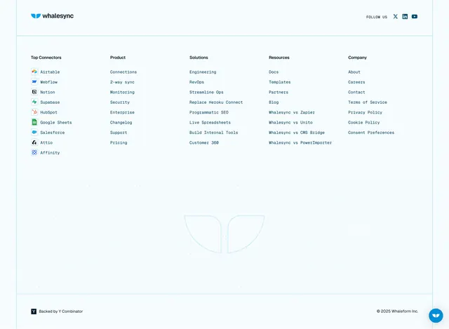
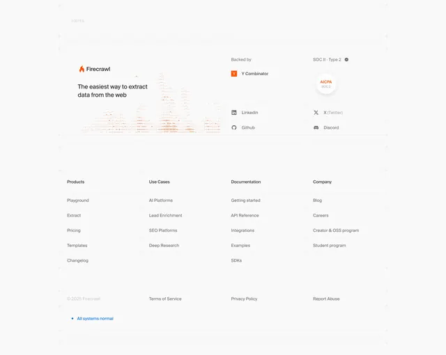
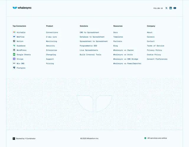
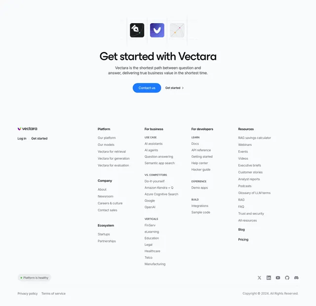
Light mega-footer combining a centered icon-tile CTA up top with a five-column, sub-labeled link directory, a status pill, and social icons below.
Summary
A light mega-footer that opens with the same centered icon-tile CTA used elsewhere on the site, then drops into a dense five-column link directory. The defining note is the live "Platform is healthy" status pill tucked into the bottom bar.
Visual description
Near-white background. Top center repeats the CTA pattern: three rounded app-icon tiles on faint dashed guide lines, a large "Get started with Vectara" headline, two muted sub-lines, and a blue "Contact us" pill beside a "Get started" text button. Below, the Vectara wordmark and Log in / Get started sit at left, then five link columns (Platform, For business, For developers, Resources, plus Company and Ecosystem stacked in the second column). Several columns carry small grey ALL-CAPS sub-labels (USE CASE, VS. COMPETITORS, VERTICALS, LEARN, EXPERIENCE, BUILD) grouping their links. A bottom bar holds a grey pill with a green dot reading "Platform is healthy" at left and five round social icons (X, LinkedIn, YouTube, GitHub, Discord) at right, above a thin rule with Privacy policy / Terms of service and the copyright.
Key takeaway
Reusing the page's CTA block verbatim as the footer's top tier, then organizing a large link set with small all-caps sub-labels inside columns so a dense directory stays scannable. The live system-status pill is a nice trust signal to bury in the footer.
Reuse notes
Best when navigation is large and you want a single, well-grouped sitemap close. Suits developer and AI products that have docs, verticals, and comparison pages to surface. Keep the sub-label grey light so it reads as a header, not a link.