
Preview image. Unlock full-res
A 21-slide Zapier brand guidelines deck built on a split title-left / visual-right grid, oversized Degular Display headlines, and a ten-color palette led by Zapier orange.
Summary
A 21-slide official brand guidelines deck for Zapier, the automation platform. Its system rests on a consistent split layout, an oversized Degular Display headline on every content slide, and a deliberately playful ten-color palette anchored by a single loud Zapier orange.
Visual description
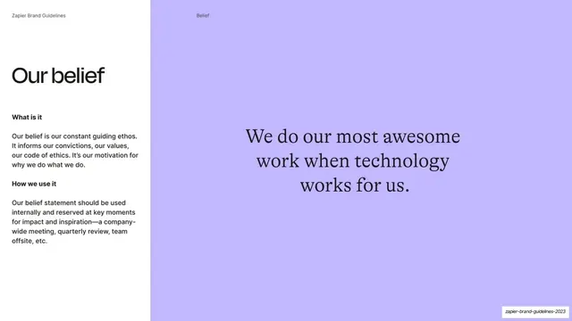
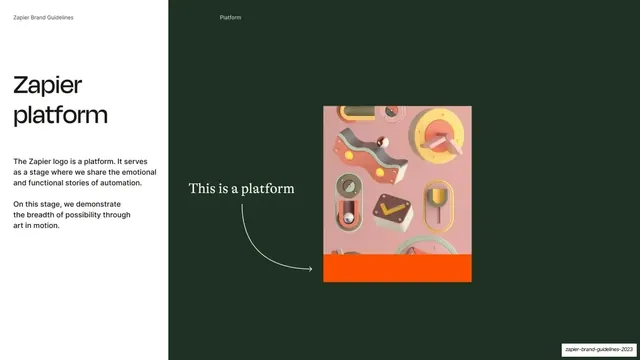
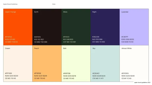
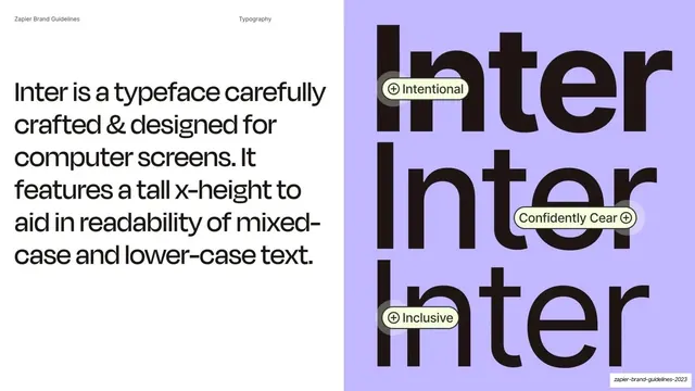
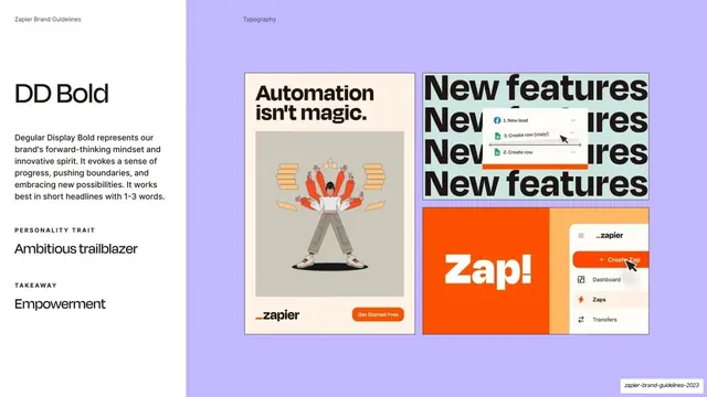
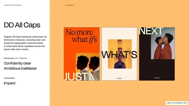
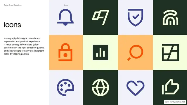
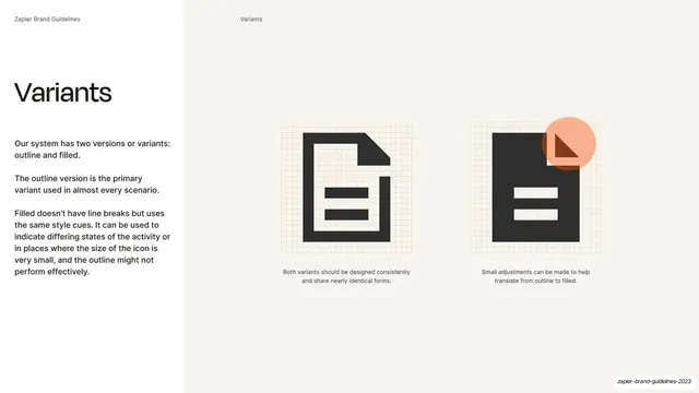
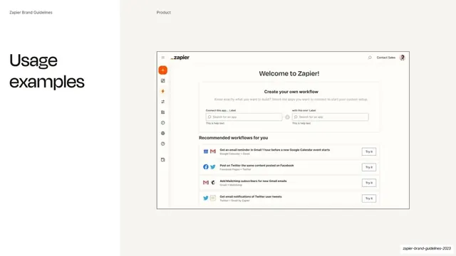
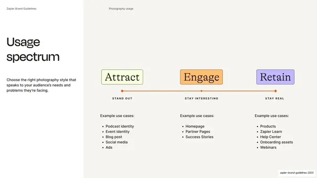
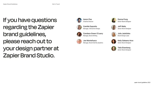
Slides run 16:9. Content slides use a fixed grammar: a thin grey running header ("Zapier Brand Guidelines" far left, a centered section label like Vision / Audience / Color / Typography / Icons / Product) sits above a two-zone body. The left zone carries an oversized near-black Degular Display headline (lowercase or mixed case, occasionally closing with a period) over small Inter body copy and bold subheads ("What is it", "How we use it"); the right zone holds a full-height visual: lifestyle photography, a 3D-render product still, color swatch grids, a color wheel, an icon grid, or a UI screenshot. Section dividers break this rhythm with full-bleed single-color fields (mint, Zapier orange, peach, lavender) carrying just one word set top-left in Degular Display, or a full-bleed campaign photo with centered Degular All Caps type. The palette is the ten named brand colors: Zapier Orange #FF4F00, Earth #201515, Moss #1F3121, Night #2B2358, Lavender #C1B7FF, Cream #FFF3E6, Peach #FFBF6E, Bolt #F6FFDB, Sky #CDE4E1, Almost White #FFFDF9. Type pairs Degular Display (warm geometric grotesque, used huge for headlines and stacked-repeat display moments) with Inter for body and on-screen UI, plus an occasional serif for pull-quotes. Icons are a two-weight (outline and filled) set shown in a tinted square grid. The deck closes on a team contact slide pairing a large lowercase headline with two columns of avatar-and-title credits.
Key takeaway
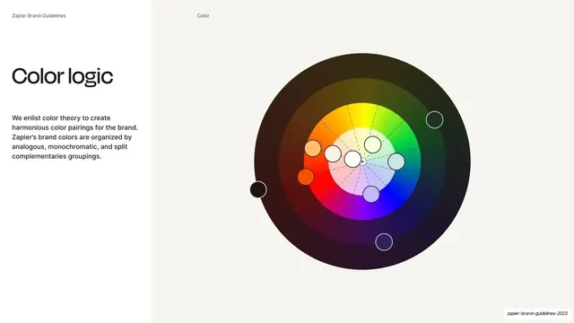
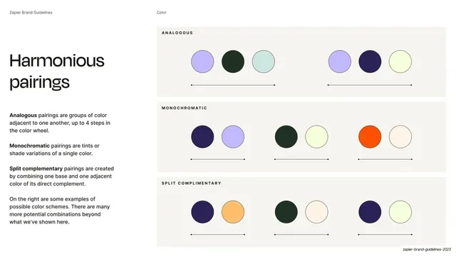
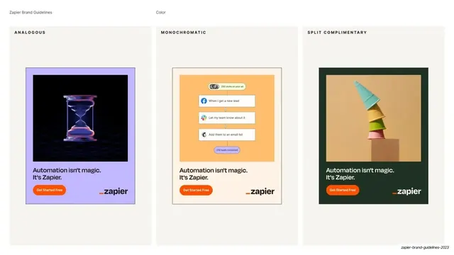
The split title-left / visual-right template that lets every content slide stay identical in structure while the right-hand visual carries all the variety. The discipline of one oversized headline plus small utility labels per slide. And the palette presentation: a ten-cell swatch grid with named colors and full hex/RGB/CMYK specs, then dedicated slides demonstrating analogous, monochromatic, and split-complementary pairings in real campaign mockups rather than abstract chips.
Reuse notes
A near-textbook reference for SaaS or B2B brand guideline decks: it covers vision, audience, belief, color, type, iconography, product UI, and photography in a single legible system. The split layout and full-bleed section dividers are directly reusable. The color-logic and pairing slides are an especially good model for documenting a palette that is broad but disciplined. Degular Display and Inter are the specified faces; swap for your own brand pair. Needs strong lifestyle and product photography to carry the right-hand visual halves.
From this deck: Zapier Brand Guidelines 2023
View deck





More like this




Keep what you find
A free account saves references to boards and can send you a weekly email of picks based on what you save.
To see every result, go Pro.