Preview image. Unlock full-res
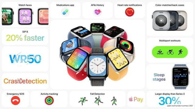
Light bento grid of Apple Watch features around a fan of color-banded watches, with playful multicolor stat lettering.
Summary
A light bento grid recapping the Apple Watch, built around a central fan of color-banded watches with each feature broken into its own white tile.
Visual description
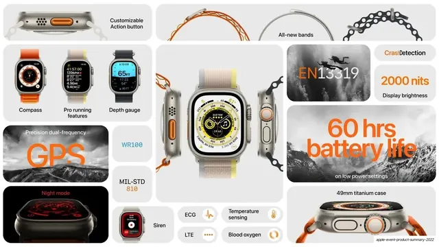
Pale grey background of white rounded tiles. The large central tile shows a circular fan arrangement of eight Apple Watches in different band and case colors, each displaying a different colorful watch face. Surrounding tiles each hold one feature, several rendered in playful multicolor lettering: "20% faster" (SiP 8) in green-blue gradient, "WR50" in blue water-styled type, "CrashDetection" in red-orange, and "30%" (larger display than Series 3) in blue. Other tiles: a strip of three "Watch faces" renders, "Medications app" (pill icon), "AFib History" (heart-rate icon), "Heart rate notifications" (red heart), "Color-matched back cases" (three case backs), "Multisport workouts" (green pill with swim/bike/run icons), "Sleep stages" with a watch render, "Emergency SOS" (red phone icon), "Activity tracking" (rainbow rings), "Fall Detection" (figure icons), and an Apple "Pay" tile. Type is black SF sans for labels with saturated multicolor display treatments on the headline stats.
Key takeaway
The radial fan of color-varied product units as a single hero tile, which shows range (colors, faces, bands) in one image. The playful per-stat color treatment ("WR50" styled like water, "CrashDetection" in alert red) gives each tile its own character while the grid keeps order.
Reuse notes
A friendly, consumer-facing variant of the bento template, lighter and more colorful than the dark product slides. The watch fan is specific to a product with many color options; reuse the radial-cluster idea for any product line with variants. Good when you want energy and approachability rather than a clinical look.
From this deck: Apple Watch SE and Series 8 feature bento (light)
View deck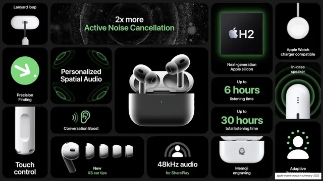
More like this


Keep what you find
A free account saves references to boards and can send you a weekly email of picks based on what you save.
To see every result, go Pro.