Preview image. Unlock full-res
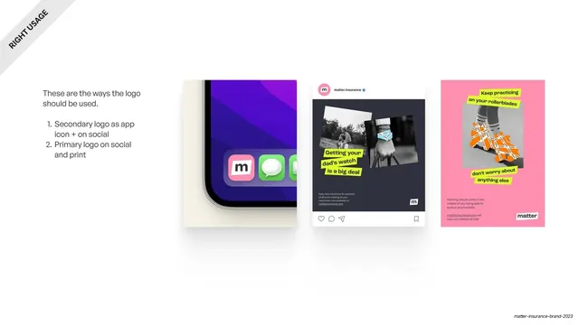
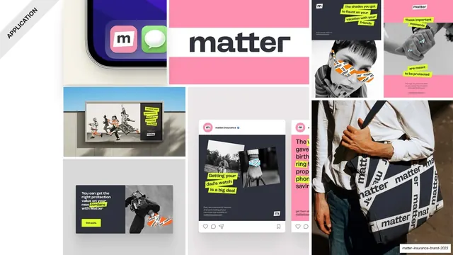
Right-usage page showing the logo in three real contexts: an app icon, an Instagram post, and a pink poster.
Summary
The correct-usage page: the logo shown working in three real-world contexts, an iPhone home-screen app icon, an Instagram post, and a pink poster, with a short numbered note on the left.
Visual description
A white full-bleed slide with a rotated "RIGHT USAGE" ribbon in the top-left corner and a short left-hand note ("These are the ways the logo should be used") followed by two numbered points (secondary logo as app icon and on social, primary logo on social and print). To the right, three overlapping mockup cards: a close-up of an iPhone home screen showing the pink "m" app icon among other apps; an Instagram post from "matter.insurance" with a black-and-white image, a neon-green highlighted caption and the "m" mark bottom-right; and a pink poster with neon-green highlighted copy over a B&W photo of taped rollerblades, signed with the white "matter" lockup. The mockups read as a small lifestyle grid.
Key takeaway
Proving the logo with live mockups instead of abstract dos, the same icon and lockup shown in the actual places they will appear (phone, feed, print). It demonstrates the system, not just the asset.
Reuse notes
A reusable "logo in context" page for any consumer brand: app icon, social post, print piece, side by side. Carry the brand devices (highlighter, tape, B&W photo) into the mockups so the page doubles as an application teaser. Needs realistic mockups to land.
From this deck: Correct logo usage in context
View deck












More like this




Keep what you find
A free account saves references to boards and can send you a weekly email of picks based on what you save.
To see every result, go Pro.