Preview image. Unlock full-res
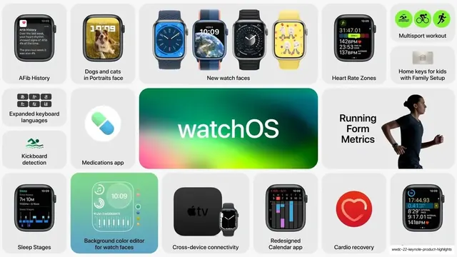
A bento grid of watchOS 9 features around a large spectrum-gradient "watchOS" tile, mixing watch-face renders, app icons and health metrics.
Summary
The watchOS slide: a dense bento grid of new Apple Watch features arranged around a glossy rainbow-gradient "watchOS" tile near the center.
Visual description
A light gray field tiled with soft-cornered cards of varied sizes. The visual anchor is a wide center tile filled with a saturated spectrum gradient (green through magenta) holding the word "watchOS" in white. Cards around it pair a short black label with one supporting element: Apple Watch screenshots (AFib History, Sleep Stages, Cardio recovery, Heart Rate Zones, a redesigned Calendar), a row of four watch-face renders spanning the top, app icons (Medications pill, Apple TV), line-art glyphs (kickboard detection, multisport workout with three green sport icons), and a cutout photo of a runner in profile beside "Running Form Metrics". Color stays mostly grayscale with green accents in the health and workout cues. Labels are small, regular-weight sans in black; no headers or dividers, just the card grid and gutters.
Key takeaway
The single gradient hero tile acting as both the section title and the one spot of full color in an otherwise gray grid. The way watch-face and screenshot tiles of different sizes interlock so a dozen-plus features sit on one screen and still scan top to bottom.
Reuse notes
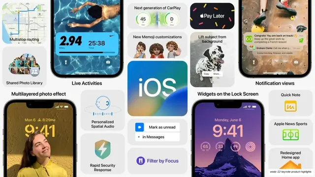
A model OS or app "what's new" slide when you need to show many small features at once. Leans on real device screenshots and clean icon glyphs to fill the small cards, so it needs good source assets. Pairs naturally with the matching iPadOS and iOS bento slides in this deck as a set.
From this deck: watchOS feature bento grid
View deck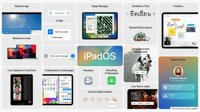
More like this





Keep what you find
A free account saves references to boards and can send you a weekly email of picks based on what you save.
To see every result, go Pro.