Preview image. Unlock full-res
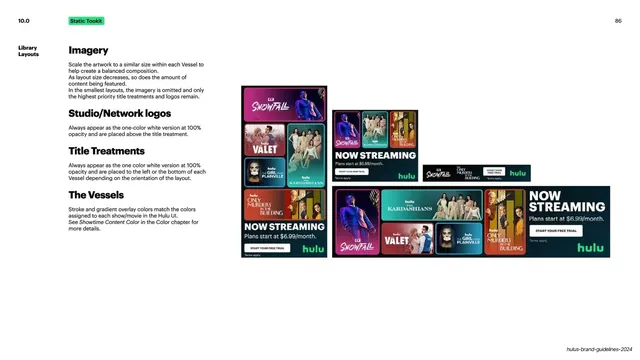
Light slide detailing the library ad layout (a dense grid of show thumbnails) with rules for imagery, network logos, title treatments, and Vessels across four sizes.
Summary
The detailed rules for the library ad layout, a dense grid of show thumbnails under "NOW STREAMING", with the same imagery, logo, title and Vessel rules shown at four sizes.
Visual description
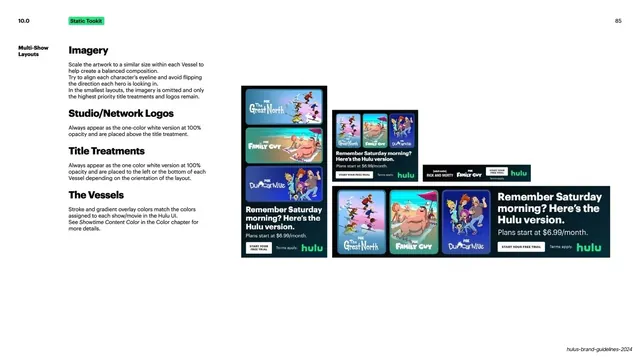
White background. A bold black "10.0" sits top-left with a green "Static Tookit" pill, and "86" top-right. The left column repeats the multi-show rule stack with slightly adjusted text: "Imagery" (scale artwork similarly within each Vessel, less content as the layout shrinks, imagery omitted at the smallest sizes), "Studio/Network logos", "Title Treatments", and "The Vessels" (stroke and gradient colors match each show's Hulu UI color). The right side shows the "NOW STREAMING" library ad at four shrinking sizes: a packed grid of show thumbnails (Snowfall, Valet, The Kardashians, The Girl from Plainville, Only Murders in the Building and more) with the green "hulu" mark, "Plans start at $6.99/month." and a "START YOUR FREE TRIAL" CTA. At the smallest banner size the grid collapses to a few logos and the CTA. A running footer sits bottom-right.
Key takeaway
Pushing the "Vessel" system to its densest case (a full library wall) and still governing it with the same four rules. The four-size strip showing the grid thinning from a full mosaic down to a logo-and-CTA banner is a clear, honest responsive demonstration.
Reuse notes
A reusable detail page for a content-heavy "browse the catalog" ad, and a good companion to the multi-show slide since they share rules and only differ in density. The graceful collapse to a minimal banner is the key idea to reuse for small ad placements.
From this deck: Library layouts
View deck













More like this
Keep what you find
A free account saves references to boards and can send you a weekly email of picks based on what you save.
To see every result, go Pro.