Preview image. Unlock full-res
A 36-slide youth-culture research report in a dark zine aesthetic, built on condensed display headlines, photocopied paper textures, and teal and purple accents.
Summary
A 36-slide research report from Complex Networks and Collective on how influence works in youth culture. Its personality comes from a streetwear-zine aesthetic: an almost-black field overlaid with photocopied and torn-paper textures, oversized condensed display headlines, and a tight three-color accent system of teal, purple, and magenta.
Visual description
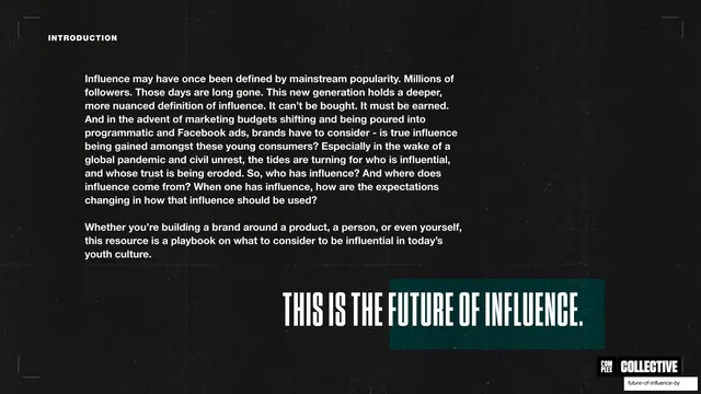
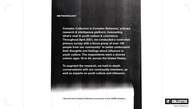
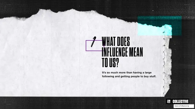
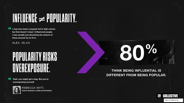
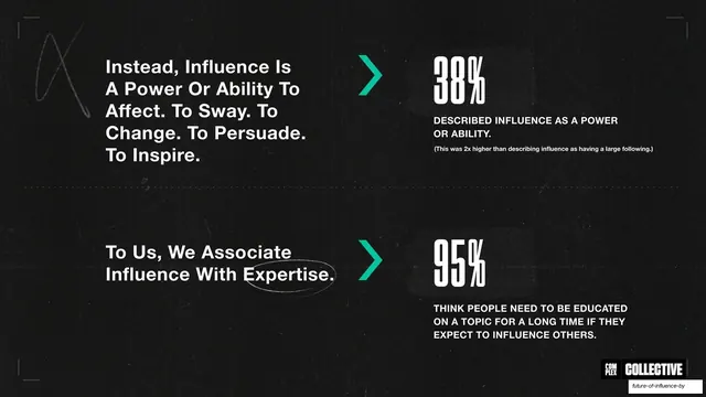
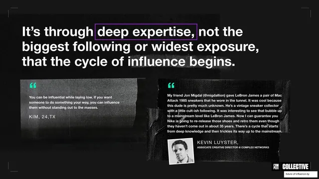
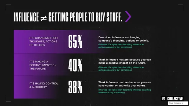
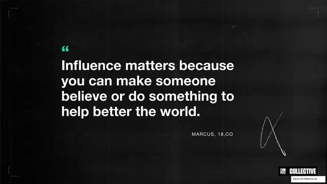
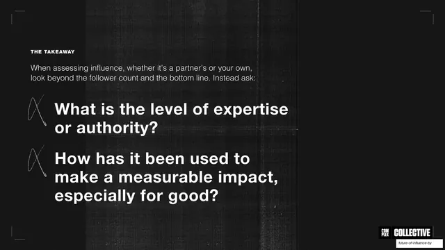
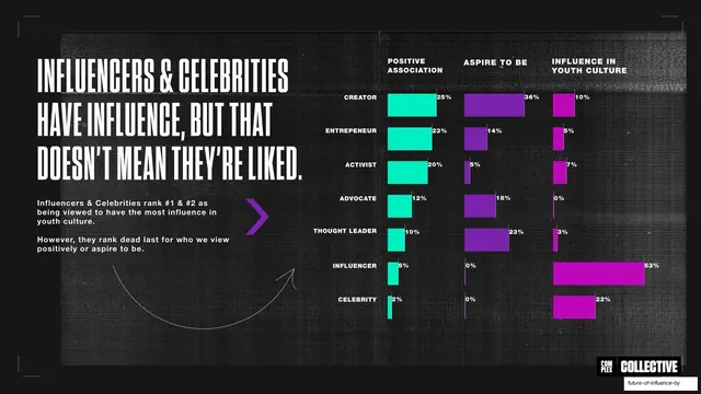
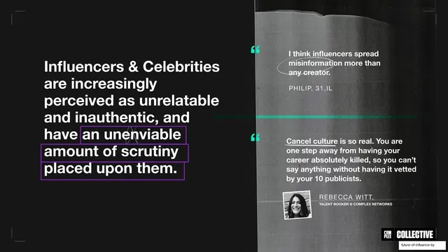
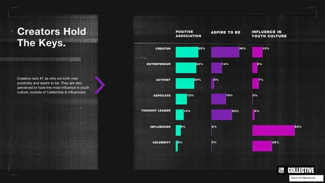
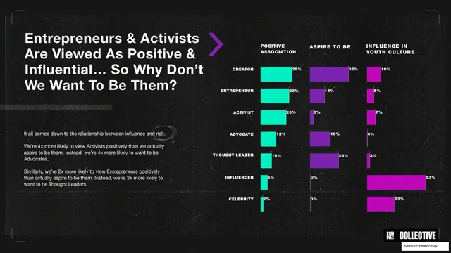
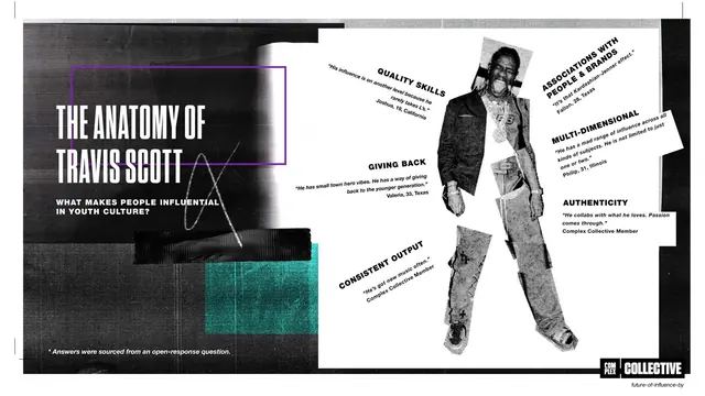
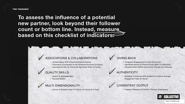
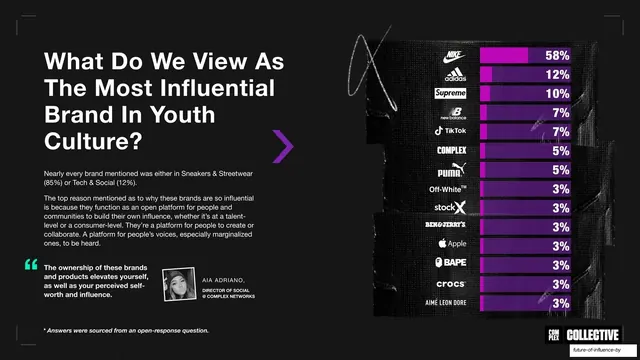
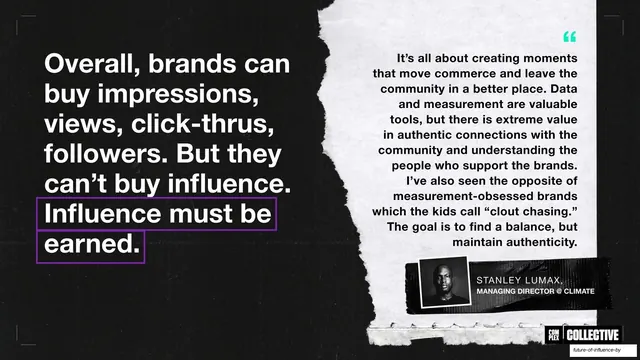
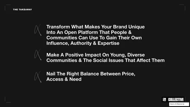
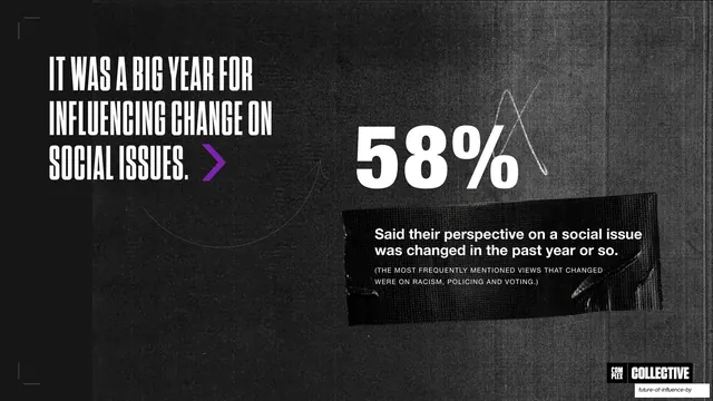
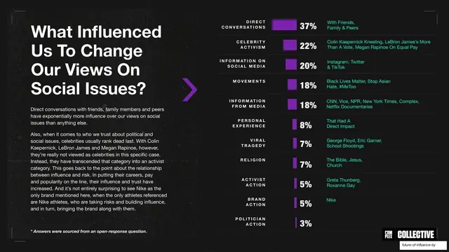
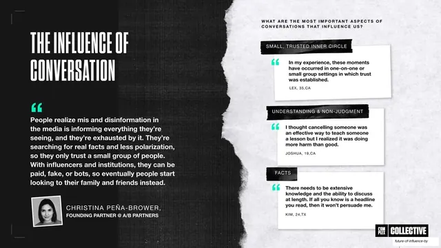
Slides run 16:9 on a near-black grunge background carrying faint scan lines, fold creases, and photocopy noise. Two type voices alternate: a very heavy, tightly-spaced all-caps condensed display face for big statements and statistics, and a clean medium-weight sans for body copy and table labels. Accents are deployed sparingly in teal (#1FE0B0), purple (#8A2BE2), and magenta (#C81FD4): teal quote marks and stat figures, a solid purple chevron used as a directional pointer, and purple-to-magenta gradient bars in the data charts. Recurring layout grammar includes thin white corner brackets and dashed column guides framing each slide; a small all-caps utility label top-left (INTRODUCTION, METHODOLOGY, THE TAKEAWAY); and the COMPLEX NETWORKS plus COMPLEX | COLLECTIVE lockup pinned bottom-right. Section dividers are full-bleed torn-paper sheets with a hand-scrawled chapter number inside a purple outline box next to a condensed all-caps question. Content slides cycle through pull-quote panels on photocopied paper cards (with small polaroid-style headshots and attributions), split headline-plus-stat rows joined by a chevron, and a repeated multi-column bar chart comparing creator archetypes across three metrics. Loose hand-drawn squiggles, circles, and underlines annotate key phrases throughout.
Key takeaway
The discipline of a single dark grunge base carrying every slide, with only three accent colors doing all the emphasis. The photocopy and torn-paper textures turn flat data slides into something that feels like a physical zine. And the chevron-plus-stat pattern, repeated to pace the deck, makes statistics feel like a drumbeat rather than a dump.
Reuse notes
A strong reference for culture, media, trend, and marketing research reports that need attitude, and for any data-heavy deck that wants to escape the clean-corporate look. The torn-paper section dividers and photocopied quote cards are directly reusable. Leans hard on a heavy condensed display face and authentic-feeling textures; with a generic sans and clean backgrounds the whole effect collapses. Best for a young, streetwear-adjacent audience rather than a buttoned-up enterprise one.
From this deck: Future of Influence by Complex Networks and Collective
View deck

More like this





Keep what you find
A free account saves references to boards and can send you a weekly email of picks based on what you save.
To see every result, go Pro.