Preview image. Unlock full-res
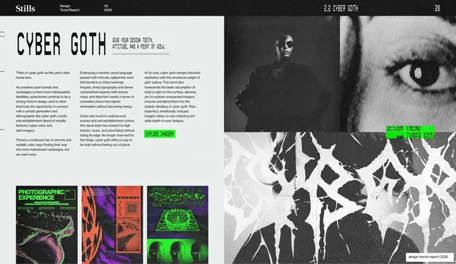
The Cyber Goth trend opener: a condensed headline and three columns of body copy on a light left panel, set against grainy black-and-white portraits and a shredded distressed \"CYBER\" wordmark on the right.
Summary
The Cyber Goth trend opener: a condensed "CYBER GOTH" headline, slogan, three columns of body copy and a green CTA sit on a light left panel, set against grainy high-contrast portraits and a shredded, distressed "CYBER" wordmark filling the right half.
Visual description
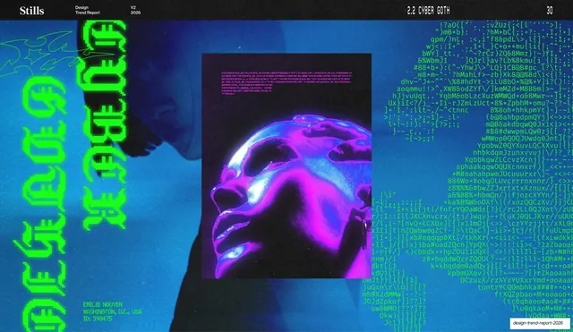
A light off-white left two-thirds carries the standard structure: the thin running header on top ("Stills", "Design Trend Report", "V2 2026", "2.2 CYBER GOTH" centered-right, page "28"), the condensed all-caps headline "CYBER GOTH" with a small slogan ("GIVE YOUR DESIGN TEETH, ATTITUDE, AND A POINT OF VIEW."), three justified columns of body copy, and a lime-green "EXPLORE IMAGERY" pill button. Three small dark photographic thumbnails (neon-lit, glitchy) sit along the bottom of the panel. The right third is dark: a grainy extreme close-up of an eye at top, and below it a heavily shredded, distressed, drippy black-and-white treatment of the word "CYBER". A small green overlay label reads "DESIGN TREND / CYBER GOTH".
Key takeaway
The same trend-opener system pushed toward a darker, harder mood: keep the clean structured left panel, but let the right side carry a distressed, eroded display treatment of the trend's own name as texture. The contrast between the orderly columns and the shredded wordmark is the whole idea.
Reuse notes
Reusable as a chapter opener for any edgy or aggressive theme where the typography itself should look damaged. Hold the left-panel grammar and green CTA constant with the deck's other openers so it stays part of the set. The distressed wordmark needs real grit; a clean drop-shadow version reads as soft.
From this deck: Cyber Goth trend intro spread
View deck