Preview image. Unlock full-res
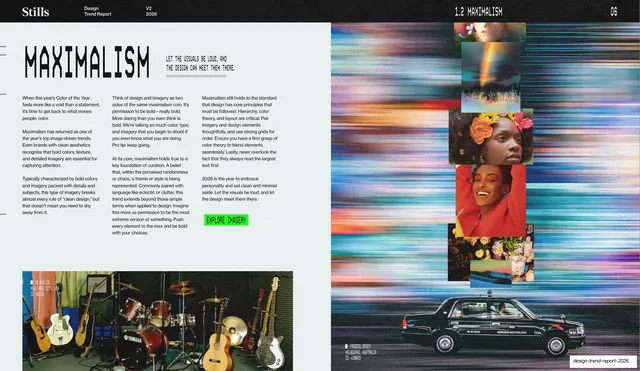
Maximalism trend spread with a stencil headline and three-column body on the left, beside a dense bento grid of saturated, colorful photographs.
Summary
The Maximalism explainer: a light spread with a big stencil "MAXIMALISM" headline and three columns of body copy on the left, set against a dense, saturated bento grid of colorful photographs filling the right.
Visual description
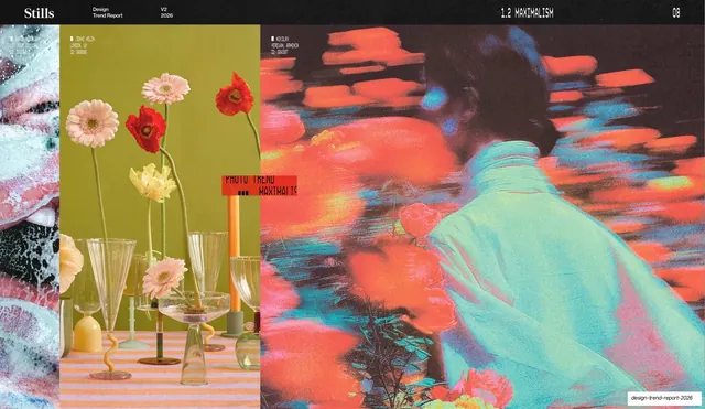
Pale-grey background with the running header ("1.2 MAXIMALISM", page "06"). The left half leads with a large black stencil "MAXIMALISM" headline, a short all-caps monospace tagline ("LET THE VISUALS BE LOUD, AND THE DESIGN CAN MEET THEM THERE."), three columns of small body copy, and a lime-green "EXPLORE IMAGERY" button. The right half is a tightly packed bento grid of vivid images: rainbow light streaks, flower-crowned portraits, a colorful food spread, and other saturated shots. A wide photo of guitars in a room and a black sedan run along the bottom edge with monospace credits.
Key takeaway
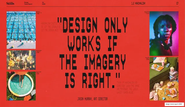
Pairing a restrained, text-led left column against a loud, color-saturated image grid on the right, so the layout itself demonstrates the "maximalism, but ordered" argument. The consistent stencil headline, tagline, three-column body, and green button keep it on the deck's per-trend template.
Reuse notes
A reusable text-and-grid trend slide, and a good model for showing "controlled maximalism" where copy stays disciplined while imagery goes bold. The bento grid flexes to any number of images. Needs vivid, varied photos to make the right side feel abundant rather than cluttered.
From this deck: Maximalism trend write-up
View deck
More like this





Keep what you find
A free account saves references to boards and can send you a weekly email of picks based on what you save.
To see every result, go Pro.