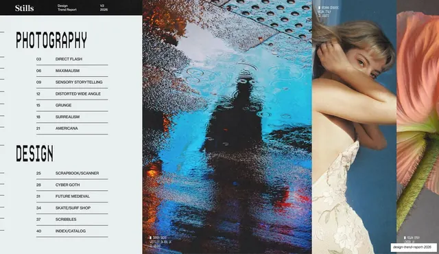
Preview image. Unlock full-res
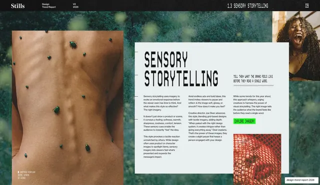
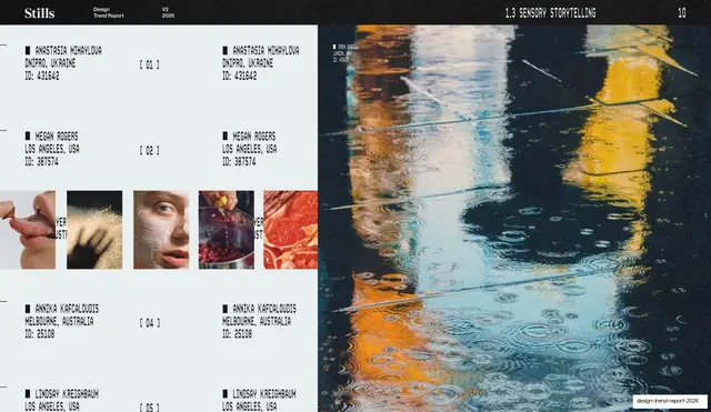
Two-section table of contents listing Photography and Design trends by page number, set beside a tall strip of three photos.
Summary
A table of contents that splits the report into two stencil-headed sections, Photography and Design, each listing its trends with leading page numbers, beside a tall three-image strip on the right.
Visual description
Pale-grey left two-thirds carries the running header (serif "Stills", "Design Trend Report / V2 / 2026"). Two large black stencil section headings, "PHOTOGRAPHY" and "DESIGN", stack down the left. Under each, a clean list pairs a small monospace page number with an all-caps trend name on a dotted leader line: Photography runs Direct Flash, Maximalism, Sensory Storytelling, Distorted Wide Angle, Grunge, Surrealism, Americana; Design runs Scrapbook/Scanner, Cyber Goth, Future Medieval, Skate/Surf Shop, Scribbles, Index/Catalog. The right third is a tall strip of three vertical photos: a blue rain-puddle reflection, a pale figure curling against a wall, and a soft pink flower, each with a small monospace credit.
Key takeaway
Using oversized stencil section headings as the spine of a contents page so the index reads as structure, not a list. The dotted-leader page numbers in monospace keep it scannable, and the photo strip turns an otherwise dry TOC into a visual.
Reuse notes
A clean contents pattern for any multi-section report or long deck. The two-column "section heading then numbered list" structure scales to more sections. Pair the list with a real image strip so the page does not read as plain text.
From this deck: Photography and Design contents index
View deck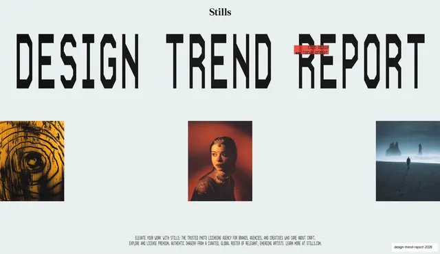




More like this







Keep what you find
A free account saves references to boards and can send you a weekly email of picks based on what you save.
To see every result, go Pro.