Preview image. Unlock full-res
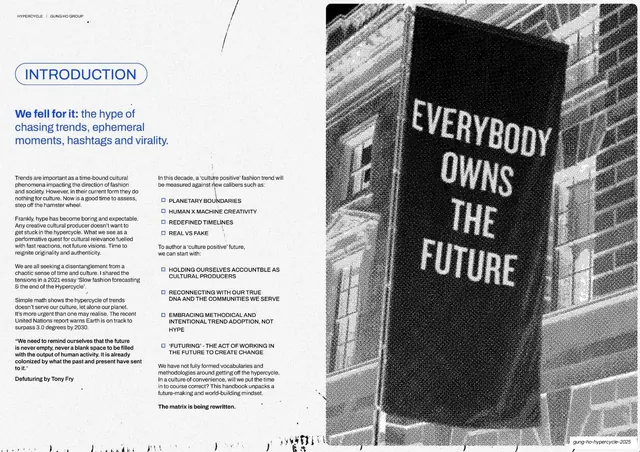
An INTRODUCTION spread pairing two columns of dense body copy with a full-height halftone photo of a black banner reading EVERYBODY OWNS THE FUTURE.
Summary
The chapter introduction: a blue "INTRODUCTION" pill and a blue-accented headline ("We fell for it") open two dense text columns on the left, with a tall halftone photograph of a hanging black banner reading "EVERYBODY OWNS THE FUTURE" filling the right half.
Visual description
White left two-thirds, full-height image on the right third, 16:9. Top-left: "INTRODUCTION" in a blue outlined pill, then a headline mixing a blue lead-in ("We fell for it:") with black continuation ("the hype of chasing trends, ephemeral moments, hashtags and virality."). Below, two columns of small body copy and a bulleted list of "culture positive" criteria (Planetary boundaries, Human x Machine creativity, Redefined timelines, Real vs fake) plus action bullets. The right edge is a coarse halftone/dithered black-and-white photo of a tall black fabric banner hung on a brick building, its white text reading "EVERYBODY OWNS THE FUTURE". Running header and page number top.
Key takeaway
Anchoring a heavy two-column text spread with one tall, gritty halftone image that carries a slogan, so the page has both an argument and a visual punchline. The blue-into-black headline is a clean way to emphasize the opening clause.
Reuse notes
A reliable layout for chapter or section intros that must hold a lot of copy but still feel editorial. Needs a strong, ideally text-bearing photograph for the image column; the halftone treatment is doing most of the styling.
From this deck: Introduction, We fell for it + banner photo
View deck