Preview image. Unlock full-res
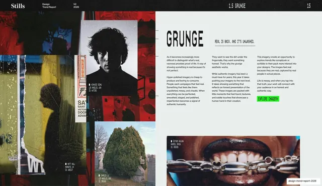
Grunge trend spread with a stencil headline and three-column body on the right, beside a layered collage of torn, gritty photographs and a lime-green call-to-action button.
Summary
The Grunge explainer: a layered collage of torn, gritty photographs fills the left, beside a stencil "GRUNGE" headline, three columns of body copy, and a lime-green "EXPLORE IMAGERY" button on a pale right half.
Visual description
A dark running header tops the slide ("1.5 GRUNGE", page "15"). The left half is a rough, overlapping collage: a high-contrast black-and-white portrait of a man with messy hair pinned over torn red and yellow posters, a marquee fragment, a cemetery shrub photo, and ripped paper edges. The right half is pale: a big black stencil "GRUNGE" headline, an underlined all-caps monospace tagline ("REAL IS BACK. AND IT'S UNWASHED."), three columns of small body copy about imperfection as authenticity, a lime-green "EXPLORE IMAGERY" button, and a dark close-up photo of a mouth biting a chain along the bottom.
Key takeaway
Using a torn, overlapping photo collage as the "image half" instead of a single clean photo, so the layout embodies the grunge trend while the right half stays orderly and readable. The underlined monospace tagline adds a hand-marked, zine-like touch.
Reuse notes
A reusable per-trend explainer where the imagery side is a collage rather than one image, good for any rough, editorial, or anti-polish subject. Keep the copy column disciplined so the collage stays the expressive element. Reuse the green button as the standard CTA.
From this deck: Grunge trend write-up
View deck