Preview image. Unlock full-res
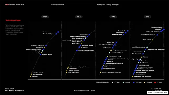
A dark Gartner-style hype-cycle chart plotting emerging technologies across 2006 to 2022 with a color-coded maturity legend.
Summary
A data slide: a dark Gartner-style hype-cycle / emerging-technologies chart, with technologies plotted as labeled dots rising along a curve across four year columns (2006, 2012, 2019, 2022).
Visual description
Black background. A faint S-curve sweeps up from lower left across the width. Four pill-shaped year labels (2006, 2012, 2019, 2022) head four dotted vertical bands. Dozens of small technology names (Augmented Reality, Internet of Things, Crowdsourcing, Explainable AI, Digital Humans, Metaverse, and many more) sit beside colored markers along the curve. A left sidebar reads "Technology trigger." in red with a short paragraph of explanatory body copy. A bottom-center legend, "Plateau will be reached:," maps marker colors to time-to-maturity (white dot under two years, light-blue two to five, blue five to ten, yellow triangle over ten, red over ten). The tiny header reads "Design Trends to Live and Die For / Technological Advances / Hype Cycle for Emerging Technologies." with standard faint credits below.
Key takeaway
Rendering a dense analyst-style chart in dark mode with a few saturated marker colors and one accent label so a wall of data still feels designed. The single red "Technology trigger." caption anchoring an otherwise overwhelming plot.
Reuse notes
Useful when a talk needs one credible data-heavy reference slide. It is deliberately information-dense and not meant to be read fully from the back of a room, more to signal rigor. Keep the legend and color logic tight if reusing; the value is the controlled palette over many points.
From this deck: Emerging-technologies hype cycle chart
View deck




More like this




Keep what you find
A free account saves references to boards and can send you a weekly email of picks based on what you save.
To see every result, go Pro.