
Preview image. Unlock full-res
A 10-slide investor pitch for Fernand, a fast SaaS helpdesk, built on a clean light layout with a fixed gray-eyebrow plus dark-navy headline grammar, green accents, and real product UI cards.
Summary
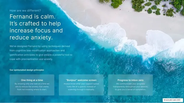
A 10-slide seed pitch for Fernand, a customer support helpdesk built for SaaS teams. Its personality is restraint: a near-white canvas, a single repeated headline grammar, and real product screenshots doing the persuading. Two slides break the calm with full-bleed imagery (a turquoise ocean, a soft pastel gradient) and a green accent keeps the whole deck on-brand.
Visual description
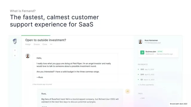
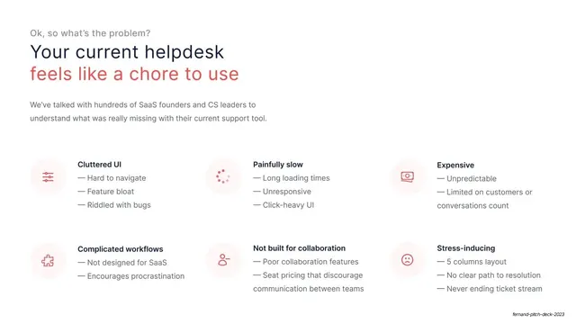
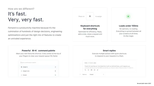
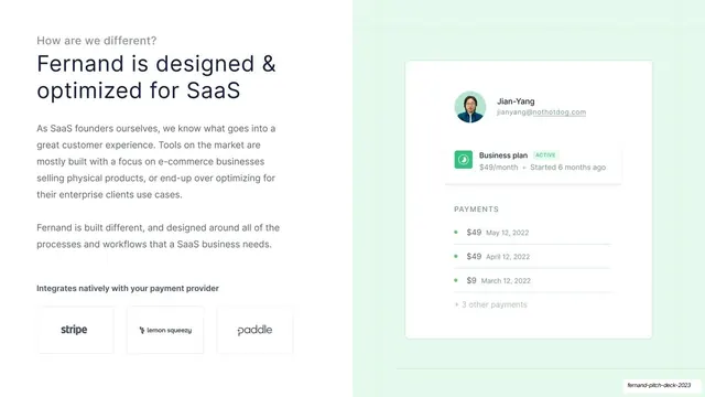
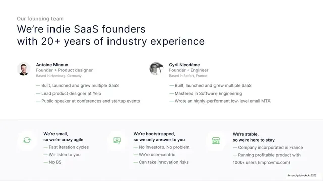
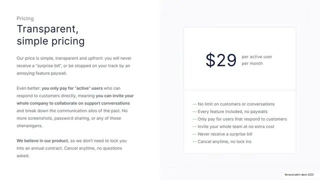
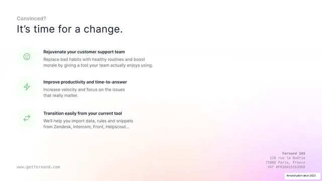
Slides run 16:9 on white. The fixed type grammar appears on almost every slide: a small gray sans-serif eyebrow question at top left ("What is Fernand?", "How are we different?", "Our vision", "Pricing"), then a large two-line headline in dark navy (#1B2433) set in a humanist sans with subtly oblique stroke terminals. Two slides color the second headline line for emphasis: red (#EB5757) for the problem ("feels like a chore to use"), green left elsewhere. Body copy is mid-gray, generous in leading, kept to a narrow left column. Green (#27AE60) is the only saturated UI accent, used for em-dash bullet lines, status pills ("ACTIVE"), check items, and small circular feature icons in tinted pill backgrounds. Recurring layouts: a centered cover with the Fernand mascot mark (a mustached porter in a navy cap) over a pastel cloud gradient; full-bleed product-inbox screenshots inside hairline-bordered cards; split text-left / product-card-right slides; a 2x3 icon-and-bullet problem grid; a 2x2 feature-card grid with inline UI fragments (a keyboard key, a command palette, a pulsing dot); a 5x3 integration logo wall with the Fernand tile highlighted in blue; a two-up founder bio row above a three-up "small / bootstrapped / stable" band; a pricing slide with an oversized "$29" and a green checklist; and a closing slide carrying the company address and getfernand.com. Footer marks "www.getfernand.com" on bookend slides only.
Key takeaway
The one fixed headline template (gray eyebrow question plus a two-line navy answer) repeated across every slide, which makes a 10-slide deck feel inevitable and calm with zero decoration. Coloring just the second headline line red on the problem slide to flag the pain without changing the layout. And letting genuine, legible product UI carry the argument instead of marketing illustration.
Reuse notes
A strong reference for early-stage SaaS and developer-tool pitch decks that want to read as calm, fast, and product-led rather than hype-driven. The eyebrow-plus-two-line-headline system is directly reusable as a deck master. The full-bleed ocean and pastel-gradient slides are effective palette cleansers between dense product slides. Depends on having real, polished product screenshots; the layout looks empty without them. The mascot and the specific oblique-terminal typeface are Fernand's own; swap for your brand.
From this deck: Fernand Pitch Deck 2023
View deck

More like this






Keep what you find
A free account saves references to boards and can send you a weekly email of picks based on what you save.
To see every result, go Pro.