Preview image. Unlock full-res
A 37-slide corporate ESG report that paces itself with full-bleed colored section dividers in oversized type, then lays out content on near-white pages with a running top nav, white rounded fact cards, and blue duotone icons.
Summary
The 2022 ESG report for Olo, a restaurant SaaS platform. Its system is built on a clean light editorial grid carried by two devices: full-bleed colored section dividers that set oversized two-line headlines in white, and content pages on near-white that pair a left text column with white rounded fact cards and blue duotone icons.
Visual description
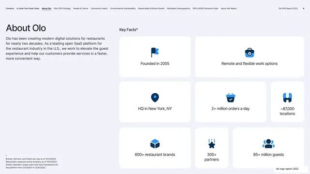
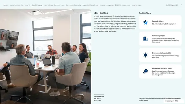
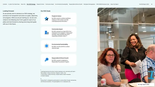
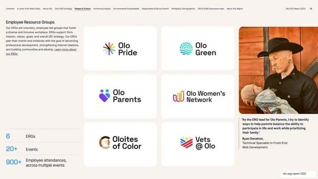
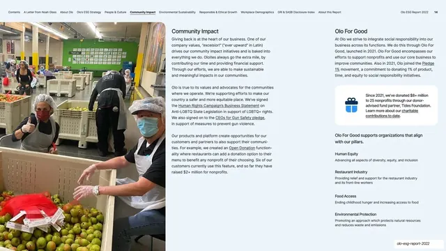
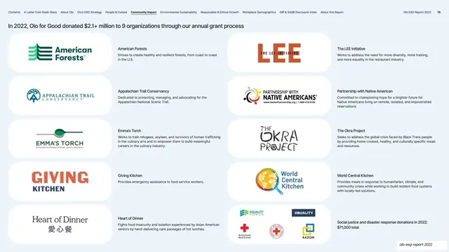
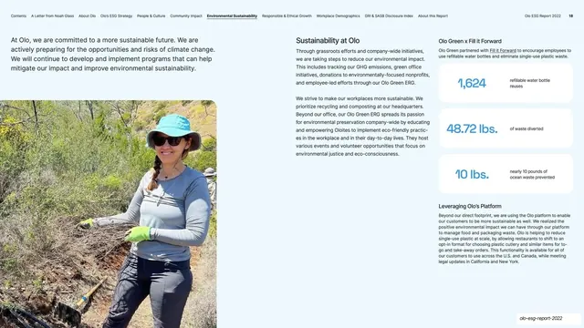
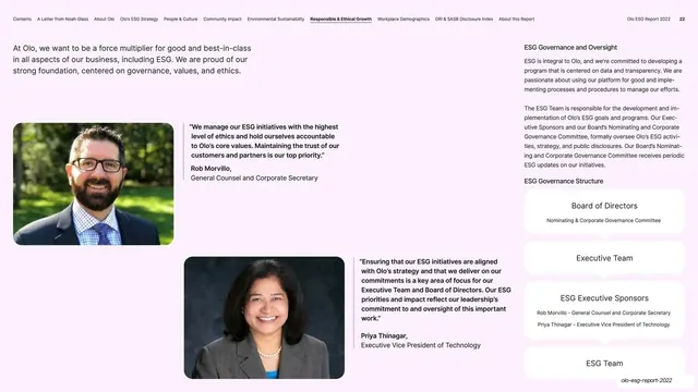
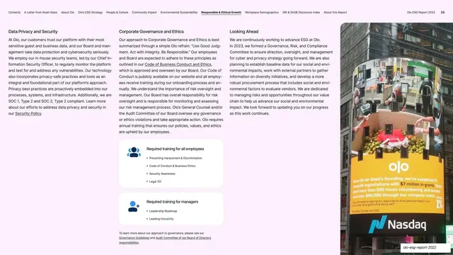
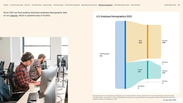
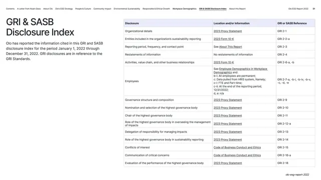
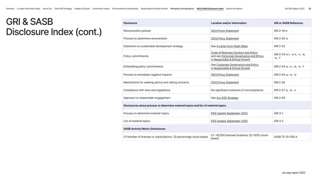
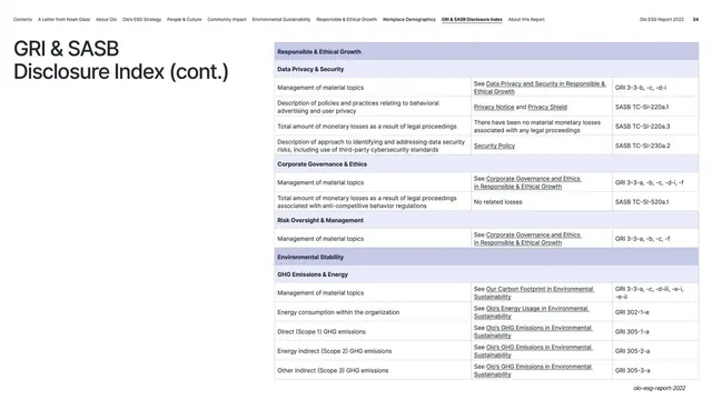
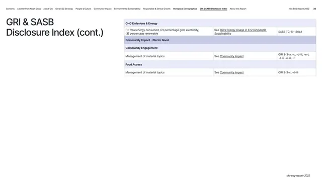
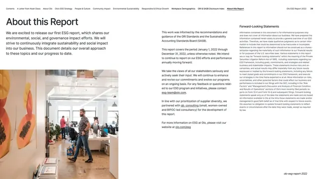
Slides run 16:9. The base content page is near-white with black body type, opened by a small all-caps running navigation bar across the very top (the report's sections listed left to right, with "Olo ESG Report 2022" and the page number at the right) sitting above the content. Section dividers break the report into chapters: each is a full-bleed solid color (teal, terracotta red, deep navy, bright blue) carrying an oversized two-line headline in white or off-white, with a small "IN THIS SECTION" arrow and a numbered mini-contents in the lower-left corner. Body type is a clean geometric sans set large for headings and in tidy multi-column blocks for running copy. Recurring content layouts: a split with a section heading and intro paragraph on the left and two to three columns of detail on the right; grids of white rounded-corner cards holding a single blue (mid-blue plus navy) duotone icon over a short stat or fact label; large editorial photographs of employees and volunteers bleeding to a slide edge; pull-quotes with an attributed name and title; logo-wall grids of partner and ERG marks; and dense demographics data tables and a GRI and SASB disclosure index toward the back. Olo's lowercase "olo" wordmark (two blue circles around a vertical bar) anchors the cover.
Key takeaway
The color-coded section divider as a pacing tool: each chapter gets one saturated full-bleed color and one oversized headline, which makes a long 37-slide report scannable and gives every section a memorable cover. The white rounded fact card with a single duotone icon is a clean, repeatable way to surface key numbers without charts. And the tiny persistent top-nav header doubles as a progress and orientation aid through a long document.
Reuse notes
A strong reference for any long-form corporate report (ESG, sustainability, annual, impact) or any deck that needs to stay legible and structured across thirty-plus pages. The divider-plus-content rhythm and the fact-card pattern lift directly into investor decks and B2B SaaS reports. Needs genuine photography and real data tables to carry the content pages; the section colors should be drawn from a defined brand palette so the dividers feel intentional rather than decorative.