Preview image. Unlock full-res
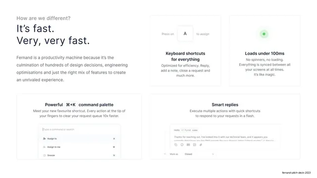
Speed-themed feature slide with a two-line headline beside a 2x2 grid of feature cards carrying inline UI fragments.
Summary
A "differentiation by speed" slide: the headline claims raw speed while a 2x2 card grid shows the features that deliver it, each with a small piece of real UI.
Visual description
Top left: gray eyebrow "How are we different?" over a two-line navy headline, "It's fast. Very, very fast.", with a four-line gray paragraph beneath. To the right and below, four hairline-bordered cards in a 2x2 arrangement, each centered with a bold title, gray sub-copy, and an inline UI fragment: an "A" keyboard key ("Keyboard shortcuts for everything"), a pulsing green dot ("Loads under 100ms"), a command-palette mock with a monospace cmd+K and assign/snooze rows ("Powerful command palette"), and a reply composer with a monospace variable token ("Smart replies"). The text column and the card grid interlock asymmetrically rather than sitting in tidy halves.
Key takeaway
Backing each speed claim with a literal scrap of the interface (a keypress, a palette, a pulsing sync dot) so abstract benefits become concrete. The monospace treatment for shortcut keys and variables signals "built for power users" without saying it.
Reuse notes
A good template for a features-that-prove-a-claim slide in a developer-tool or productivity pitch. The inline-UI cards need crisp, readable mock fragments; tiny or blurry ones lose the effect. The asymmetric interlock of text and grid is distinctive but takes care to balance; a plain 2x2 grid is the safe fallback.
From this deck: Speed features quad grid
View deck





More like this





Keep what you find
A free account saves references to boards and can send you a weekly email of picks based on what you save.
To see every result, go Pro.