Preview image. Unlock full-res
A 5-slide investor pitch for Verse, a clean-power procurement platform, built on light off-white slides with a forest-green mark, a single yellow accent, and monospace utility type.
Summary
A 5-slide seed-stage pitch for Verse, a software platform that automates clean power purchase agreements. Its design personality is restrained climate-tech: near-white slides, a single forest-green brand mark, one yellow accent reused as underline, stat ring, and chart fill, and a deliberate split between a heavy geometric sans for headlines and a monospace face for body copy and labels.
Visual description
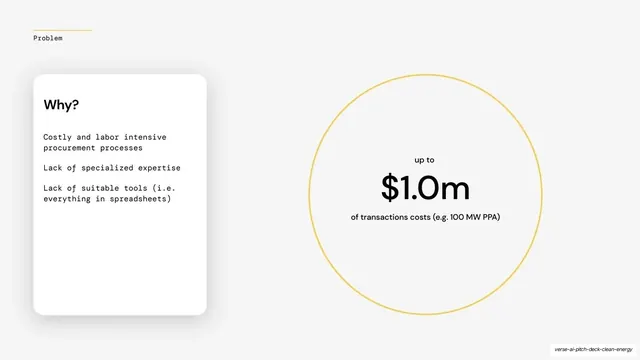
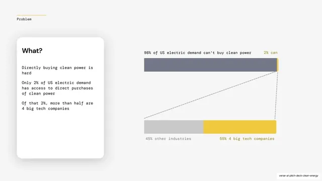
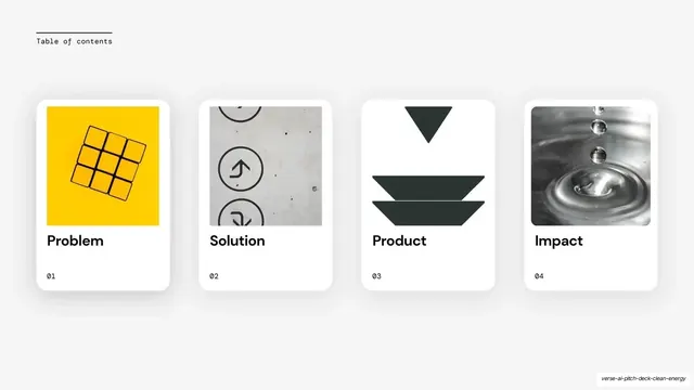
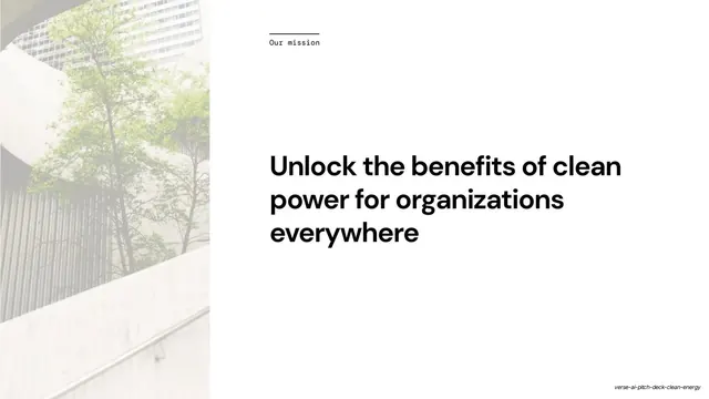
Slides run 16:9 on a flat off-white field (#F4F4F2). The brand color is a deep forest green (#2C3A30) carried by the logo mark, an inverted stack of a triangle over two trapezoids reading like a funnel. A warm amber-yellow (#F2C12E) is the only accent and recurs as a short rule under section labels, an outlined stat ring, and bar-chart fills. Type pairs two registers: section labels and all body copy are set in a monospace face (the small all-caps "Problem", "Table of contents", "Our mission" labels each sit beneath a short top rule), while headlines and big numbers use a heavy near-black geometric sans ("Why?", "What?", "$1.0m", the closing mission statement). Recurring layout grammar: content slides split into a white rounded-corner card with a soft drop shadow on the left (holding a sans headline plus monospace bullets) and a data visual on the right (a yellow stat ring, or a comparison bar chart with dashed connector lines). The table-of-contents slide breaks this with a four-card row, each white card carrying a square image thumbnail, a sans label, and a zero-padded index (01 to 04). The mission close is a two-column split: a green-tinted duotone photo of trees against a building bleeds off the left edge, an oversized three-line headline sits on white at right.
Key takeaway
The strict two-typeface system, monospace for everything utility and a heavy sans only for headlines and numbers, which makes a near-monochrome deck feel engineered rather than plain. The single-accent discipline: one yellow doing the work of label rule, stat ring, and chart fill across the whole deck. And the floating white card on a barely-off-white ground, which separates copy from data without drawing a hard container.
Reuse notes
A strong reference for early-stage climate, energy, or technical B2B pitch decks that want to read calm and credible rather than loud. The card-left / data-right problem-slide template and the four-card table of contents are directly liftable. The monospace body face reads as deliberate at headline and bullet scale but would tire over dense paragraphs; keep copy short. The look depends on disciplined white space, so it weakens if slides get crowded.